Como Golf Club · Recreation
A private club site that reads like one
A members' club charging a premium for the experience was running a site with typos in the headline and no way to book a tee time without calling the pro shop. We rebuilt it to match what members were actually paying for.
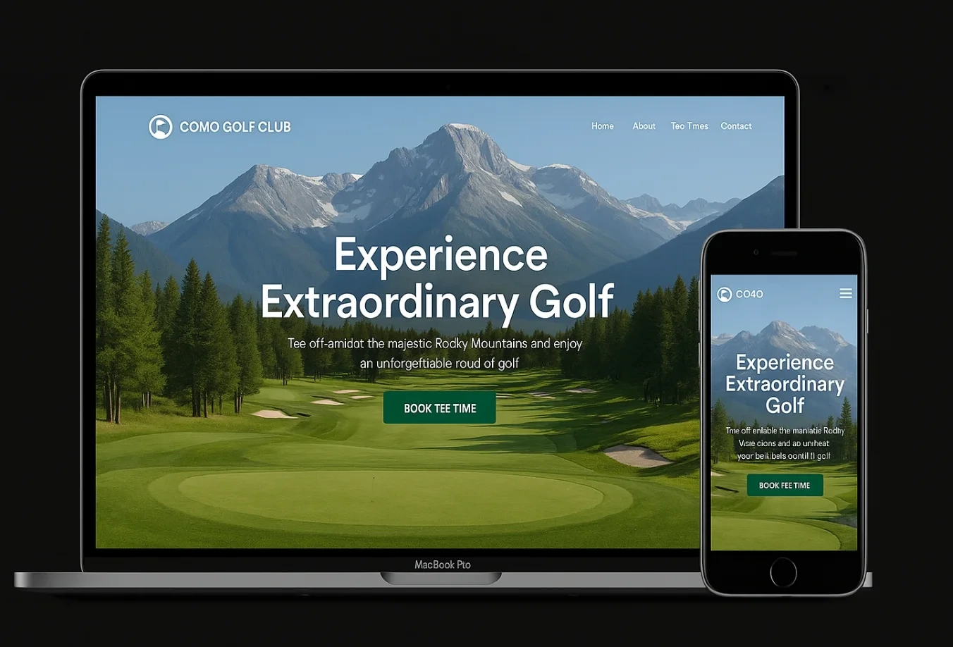
The problem
Como Golf Club sits against the Rockies, with initiation fees and a waitlist to match. It is the kind of course where the membership director's job is partly about maintaining an impression — and the website was working against her.
The previous site had been built by a relative of a board member years earlier and never revisited. Small errors had crept in: a misspelled word in the hero headline, a broken font on mobile, a “Tee Times” link that led to a contact form instead of a calendar. None of it was dramatic on its own. Together, it read as a club that wasn't paying attention.
The practical cost was a pro shop phone that rang constantly with tee time requests that a booking calendar would have handled in four clicks, and a membership page that listed dues but nothing about what came with them — so prospective members called to ask questions the site should have answered.
The approach
Three moves, in order.
01
Proofread and rebuild the type system
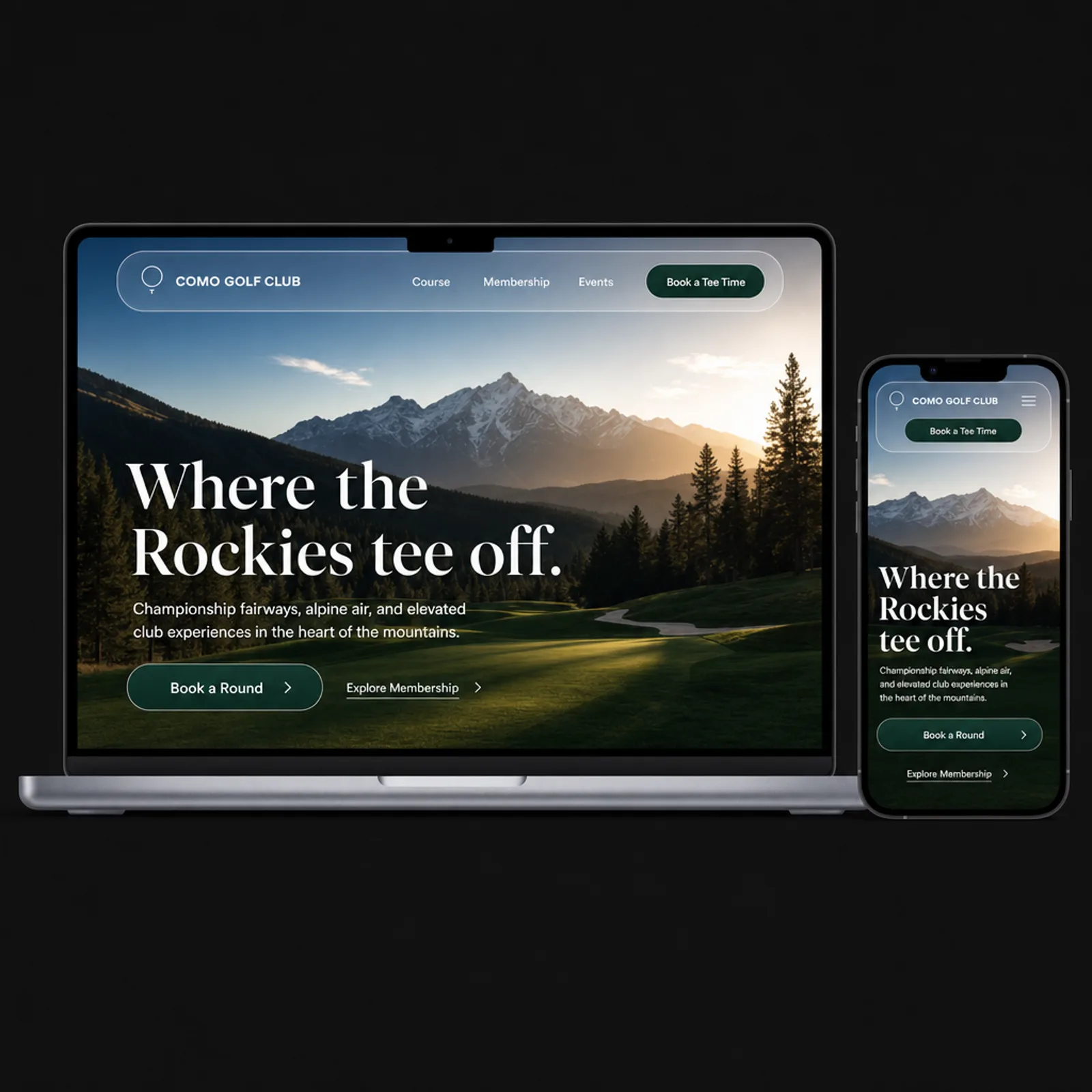
Every line of copy was rewritten and checked. A single elegant serif for headings and a clean sans for body text replaced the mismatched fonts that broke on smaller screens.
02
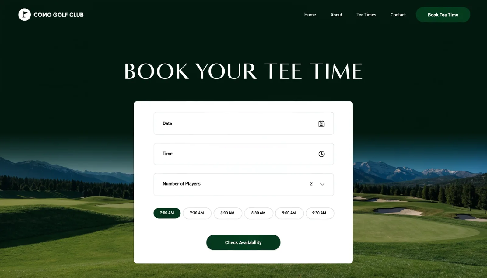
Put a real calendar behind “Tee Times”
Members and guests now pick a date, a time and a party size and get instant confirmation, pulling from the same availability the pro shop already manages.
03
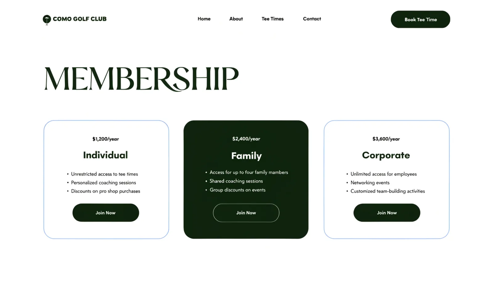
Answer the membership questions before they're asked
Individual, Family and Corporate tiers are laid out with what each one actually includes, so a prospective member can decide before they call rather than during the call.
The work
What we built.
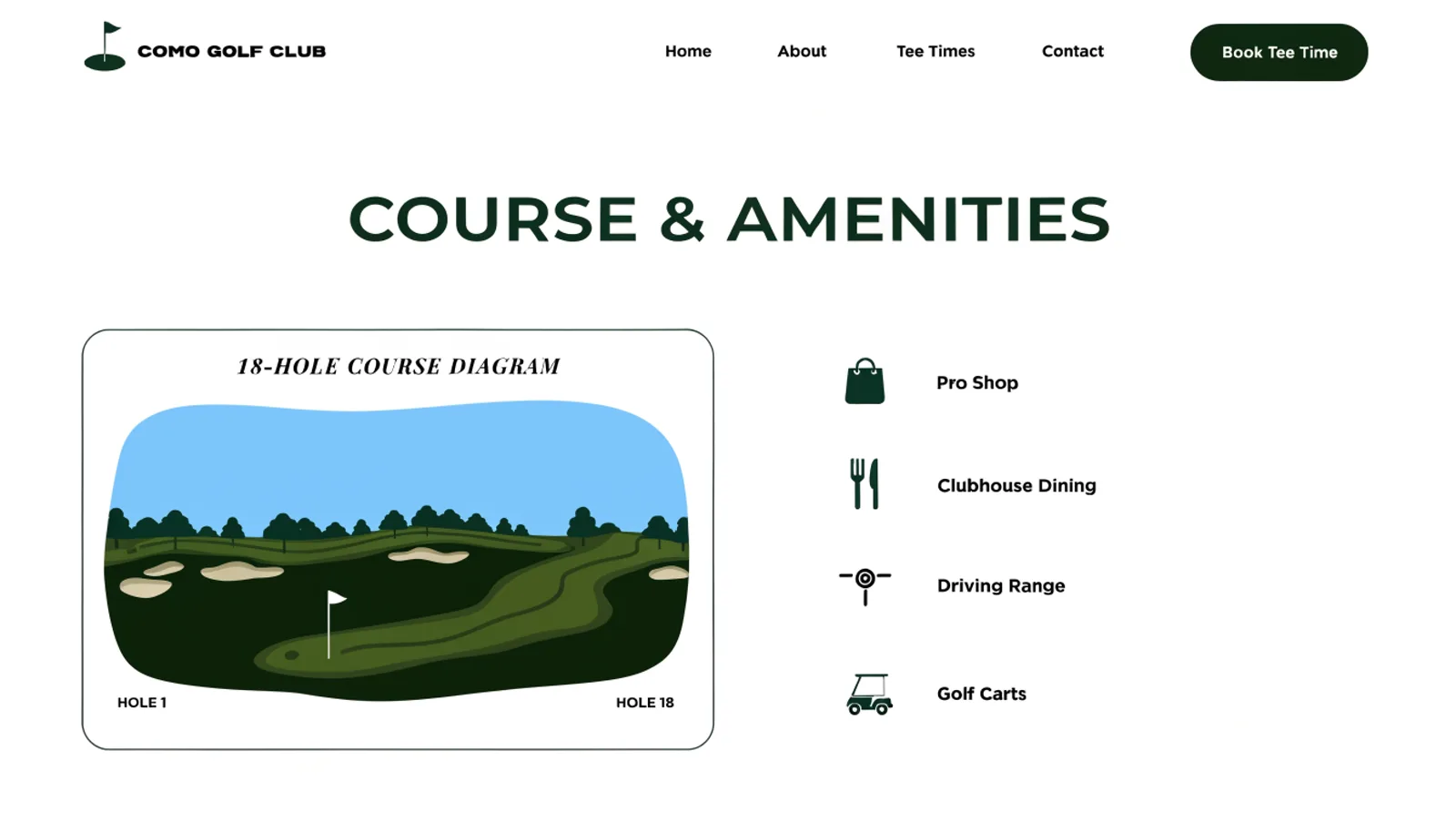
The new homepage
Also delivered
A full copy edit of every page on the site, and a short style guide so future updates don't drift back into the errors we fixed. Structured data for local search, since “golf course near me” searches were sending traffic to a site that undersold the place.
Results
Six months after launch.
71%
Of tee times now booked online
−38%
Pro shop calls for booking requests
2.3×
Membership enquiry form submissions
0
Typos, at last count
“We charge a premium and the website looked like it was free. Members noticed the old one, mostly by not saying anything and just calling instead. Nobody's called to point out a typo since we launched — that's how I know it's working.”
Renata OseiMembership Director, Como Golf Club
Figures are illustrative of the outcomes this engagement was designed to produce and are shown here for portfolio purposes.