Crossmark Accounting · Financial Services
Onboarding that starts before the first call
Crossmark sells outsourced bookkeeping to small business owners who are already overwhelmed — the last thing they need is a vague ‘get started’ button and no idea what happens next. We built a site that shows the whole process before anyone commits to it.
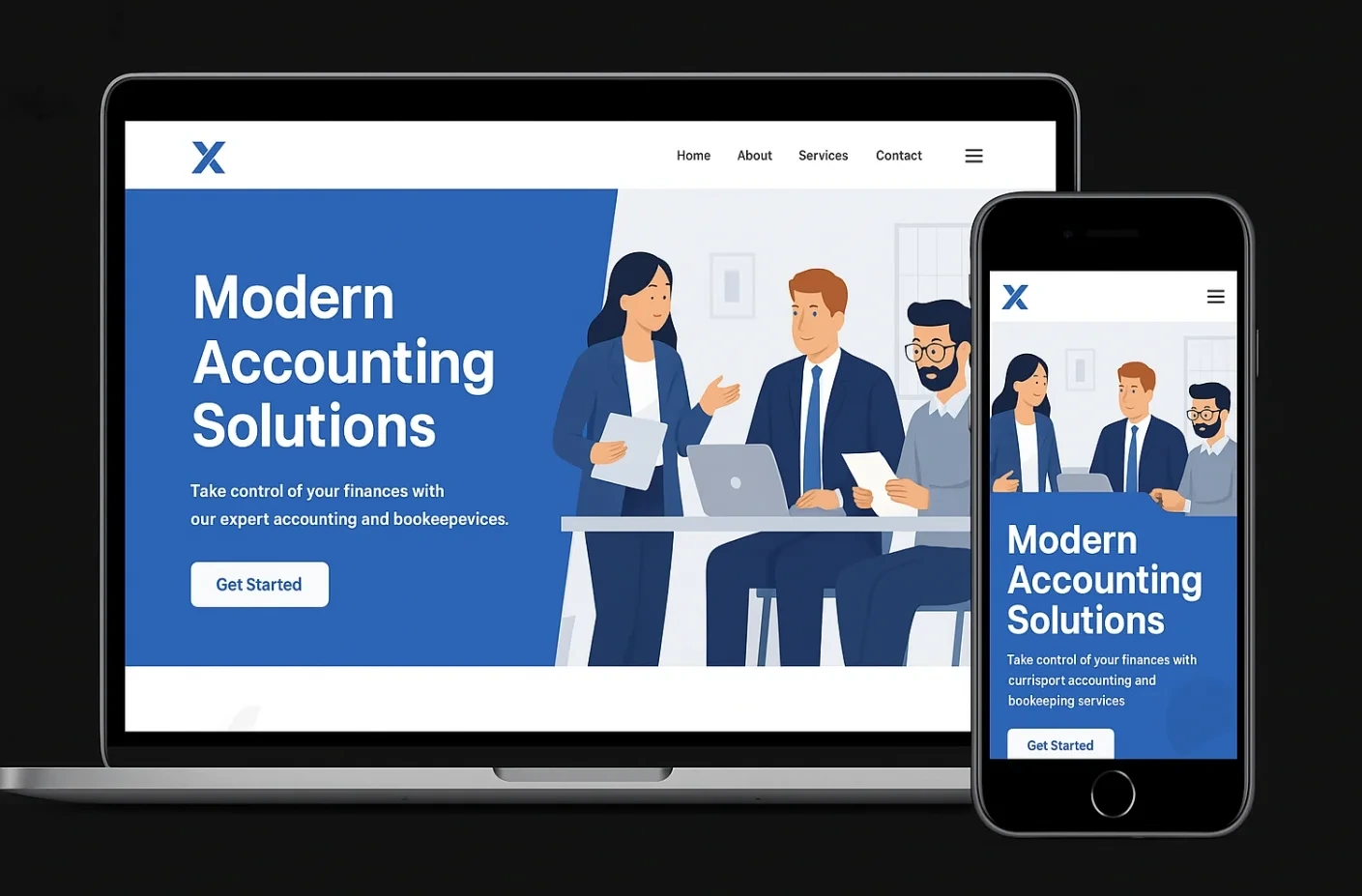
The problem
Crossmark's pitch to small business owners is relief: hand over the books, stop dreading tax time. But the site undercut that pitch by being exactly the kind of vague, faceless process owners already feared — a single “Get Started” button with no explanation of what came next.
For a business owner already stretched thin, that ambiguity was a real barrier. Outsourcing your books requires trust, and trust needs a visible process: what do I hand over, when do I meet someone, how long until this is actually running.
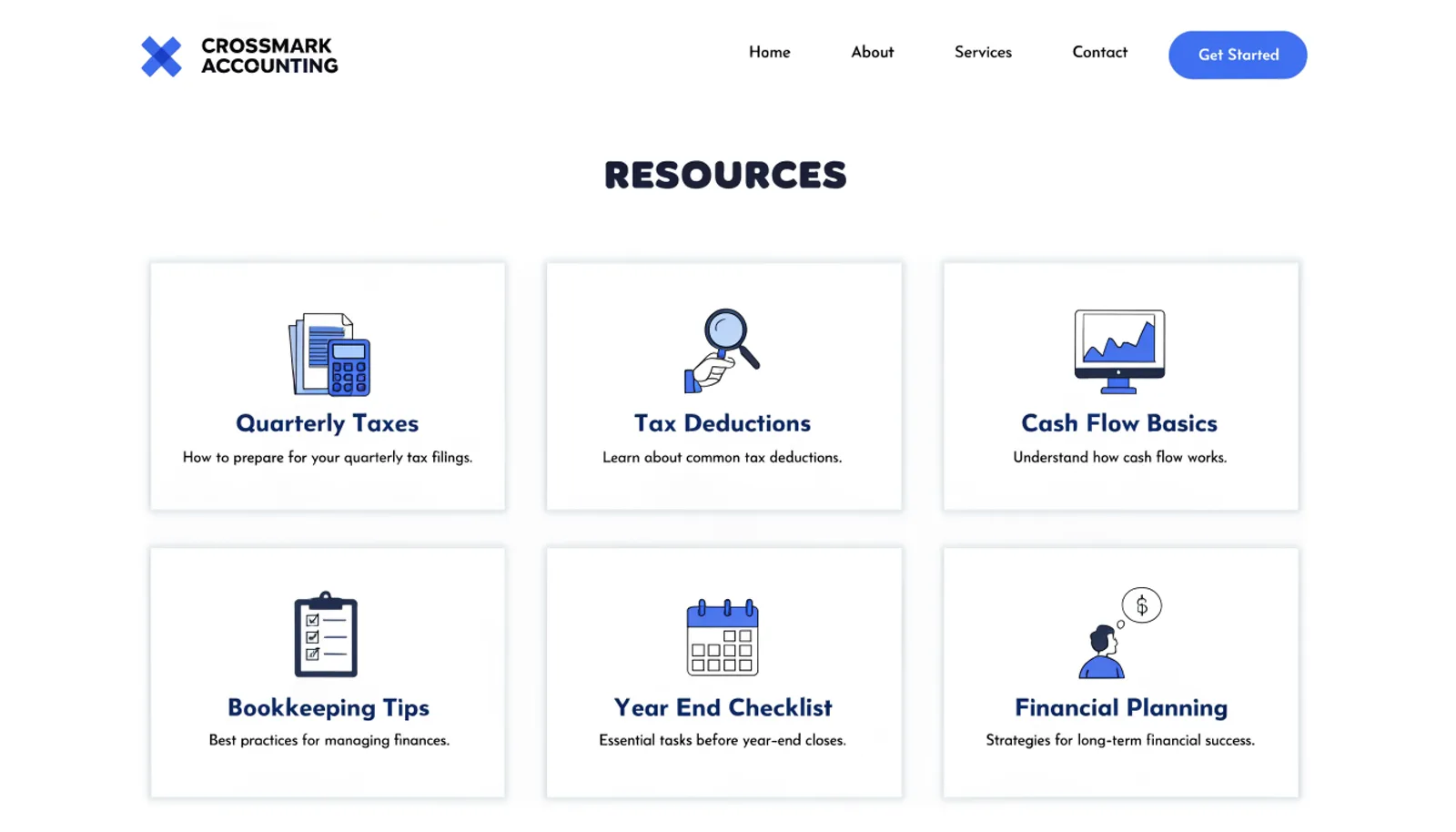
The old site also had no resource content at all, despite obvious searches — “quarterly tax deadlines,” “how to read a cash flow statement” — that a small business owner runs before they're ready to hire anyone.
The approach
Three moves, in order.
01
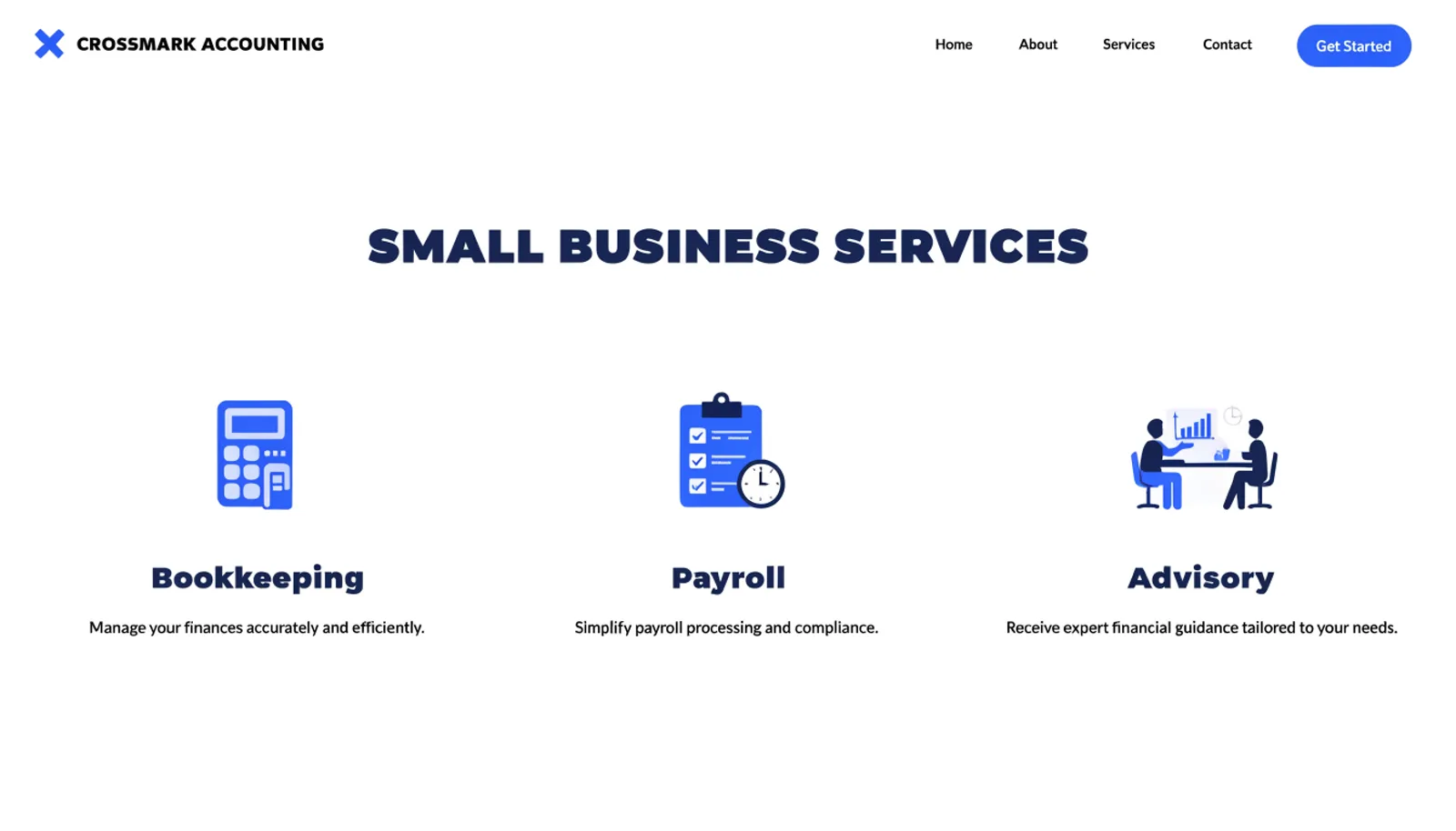
Name the services in owner-friendly terms
Bookkeeping, Payroll and Advisory replaced one paragraph of jargon, each illustrated in the same friendly style the brand already had.
02
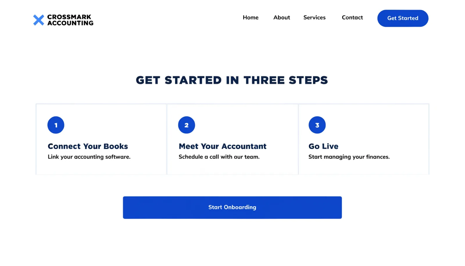
Show the whole onboarding process up front
A three-step tracker — Connect Your Books, Meet Your Accountant, Go Live — tells a nervous owner exactly what the next month looks like before they click anything.
03
Answer the questions people search before they're ready to hire
A resource library covering quarterly taxes and cash flow basics captures owners earlier in the decision, while they're still researching rather than ready to commit.
The work
What we built.
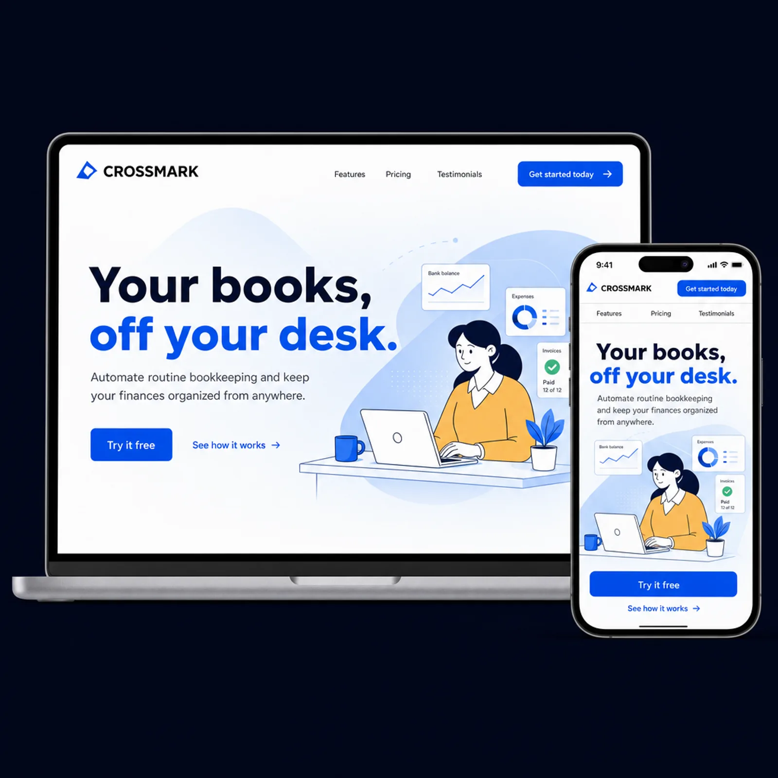
The new homepage
Also delivered
A simple integration badge row showing which accounting software Crossmark already connects to, since “will this work with what I already use” was the most common unanswered question in sales calls.
Results
First two quarters on the new site.
+61%
Onboarding flows started online
44%
Completion rate through all three onboarding steps
2.8×
Resource page traffic from organic search
+19%
New clients citing the process page as reassuring
“Our clients are already stressed before they call us — that's usually why they're calling. Showing the actual three steps instead of a vague button took a lot of that anxiety out of the decision.”
Talia ReyesFounder, Crossmark Accounting
Figures are illustrative of the outcomes this engagement was designed to produce and are shown here for portfolio purposes.