Little Sprouts Daycare · Childcare
Letting parents see the day before they book it
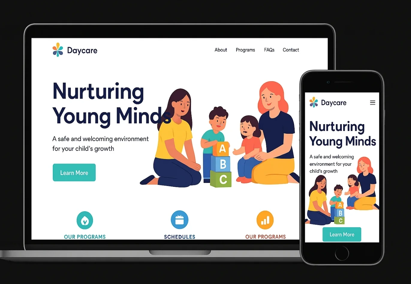
Choosing a daycare is one of the more anxious decisions a parent makes, and Little Sprouts' site gave them nothing to go on — a nice illustration and a phone number. We built a site that shows the actual day, so a tour is confirmation, not discovery.
The problem
Little Sprouts has waitlists in every age group, built almost entirely on parent referrals. The website hadn't needed to work hard — until a director noticed prospective families were touring once and not enrolling, more often than the waitlist numbers should have allowed.
The reason became obvious on the site itself: a homepage illustration and three nav links leading to pages with a paragraph each. There was no way to see what a day at the centre actually looked like, no program breakdown by age, and booking a tour meant calling the front desk during hours that overlap with nap time and pickup.
For parents comparing several centres before their child's spot opens, the ones that showed the most — photos, schedules, specifics — were winning the decision before Little Sprouts even got a tour booked.
The approach
Three moves, in order.
01
Break programs out by age
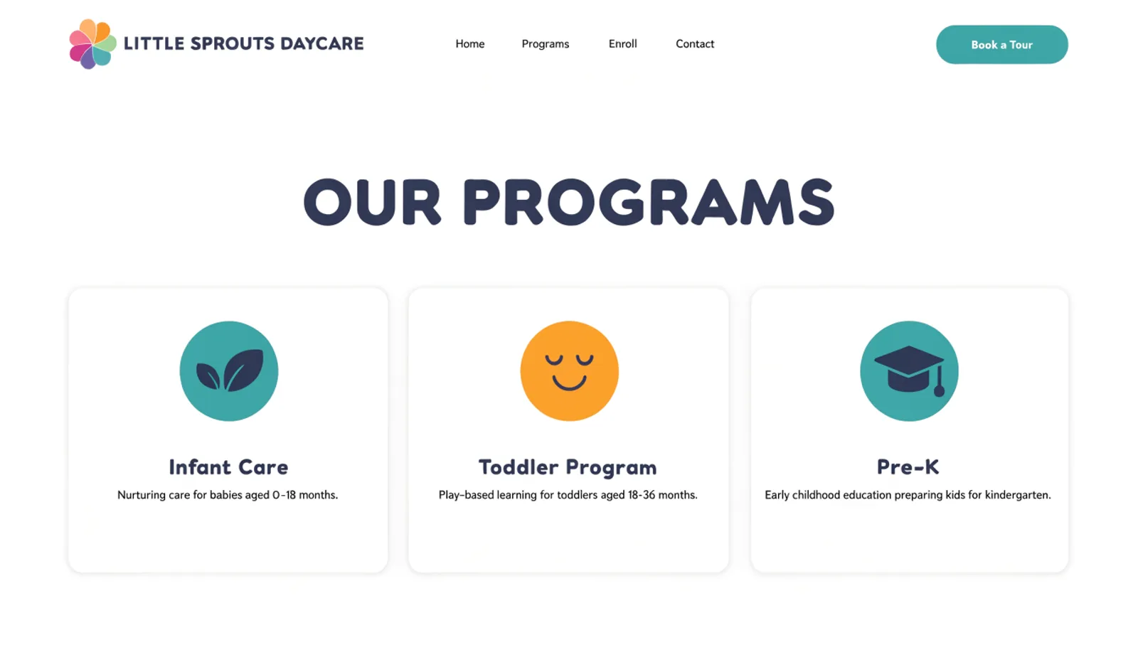
Infant Care, Toddler Program and Pre-K each get their own page, so a parent can find the specifics for their own child instead of one generic overview.
02
Show the actual day
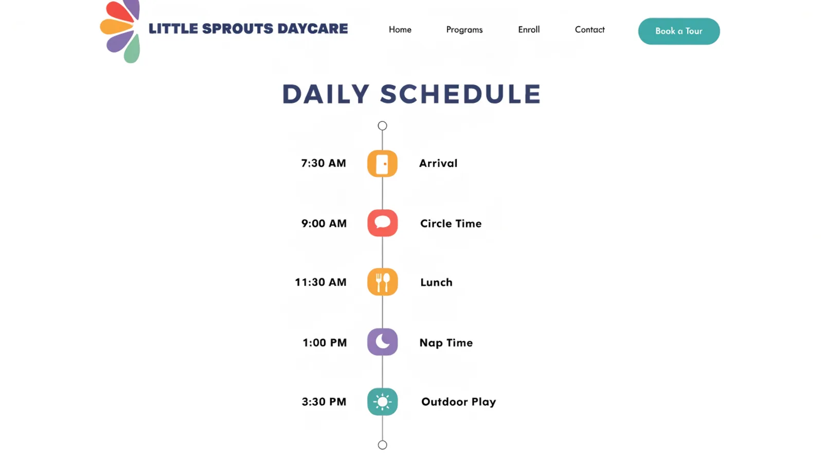
A visual timeline — arrival, circle time, lunch, nap, outdoor play — replaces vague reassurance with the specific rhythm a child will actually experience.
03
Let a tour be booked in one form
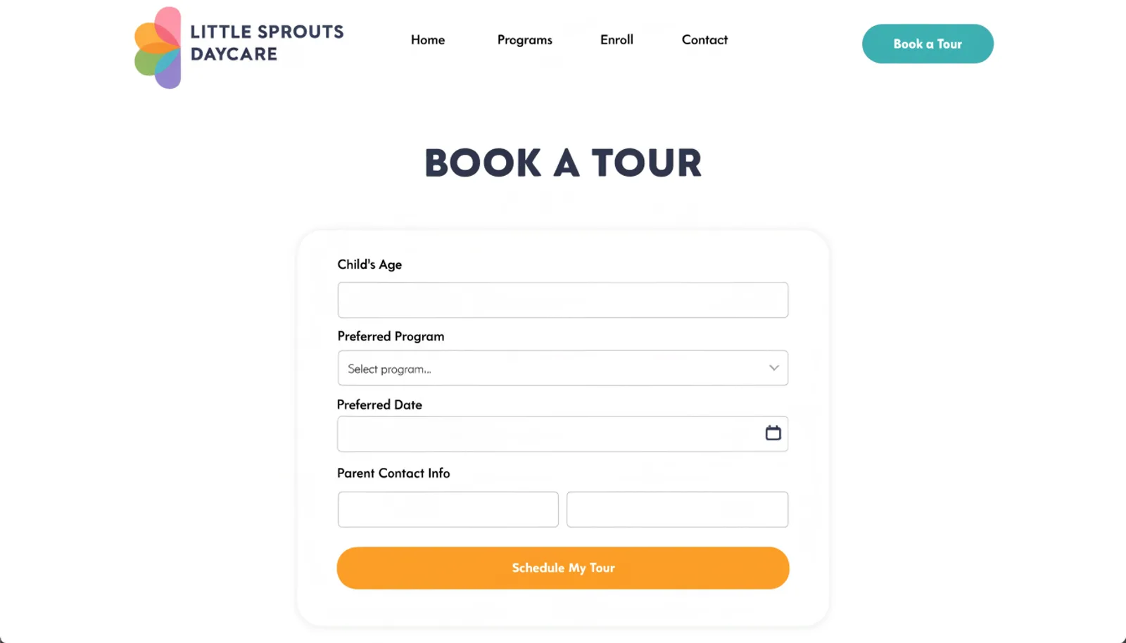
A short request form captures the child's age and preferred program, so tours are scheduled around the centre's day rather than around whenever the phone gets answered.
The work
What we built.
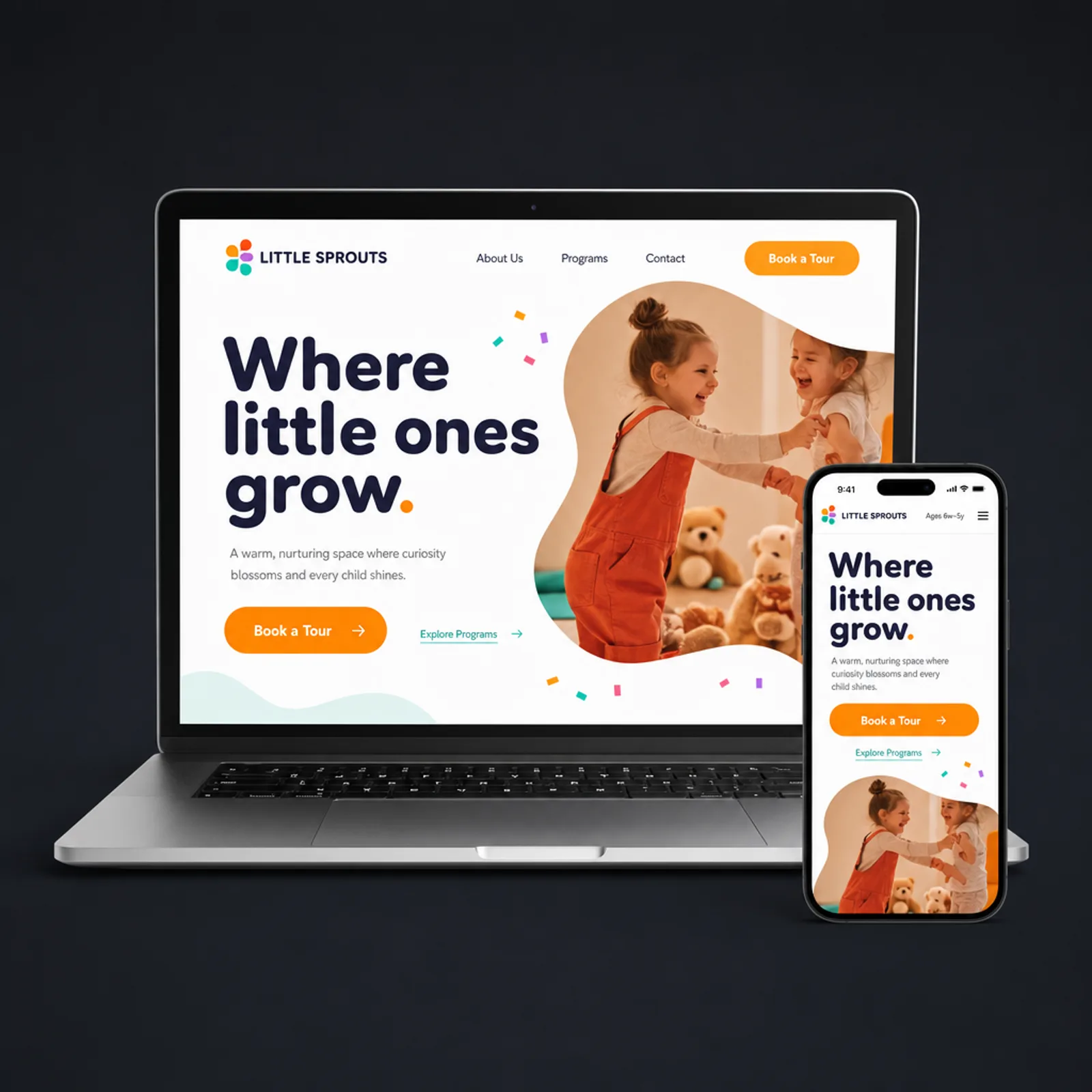
The new homepage
Also delivered
A short photo-consent-gated gallery of real classroom moments, refreshed each term, so the site keeps showing the centre as it actually is rather than a single set of stock illustrations.
Results
First enrollment cycle on the new site.
+56%
Tours booked online
+31%
Tour-to-enrollment conversion
−40%
Front-desk calls during nap-time hours
3
Age-specific program pages, up from one
“Parents were touring and still not sure what a day actually looked like. Now they walk in already knowing the schedule, and the tour just confirms what they already believed — that's a much easier close.”
Naomi ChastainDirector, Little Sprouts Daycare
Figures are illustrative of the outcomes this engagement was designed to produce and are shown here for portfolio purposes.