Butcher & Block · Food & Beverage
A butcher shop you couldn't order from
Butcher & Block built a loyal counter following on whole-animal butchery and a genuinely good catering program. None of it was for sale online — the site was a single photo and a slogan. We gave the shop a storefront that actually sells.
The problem
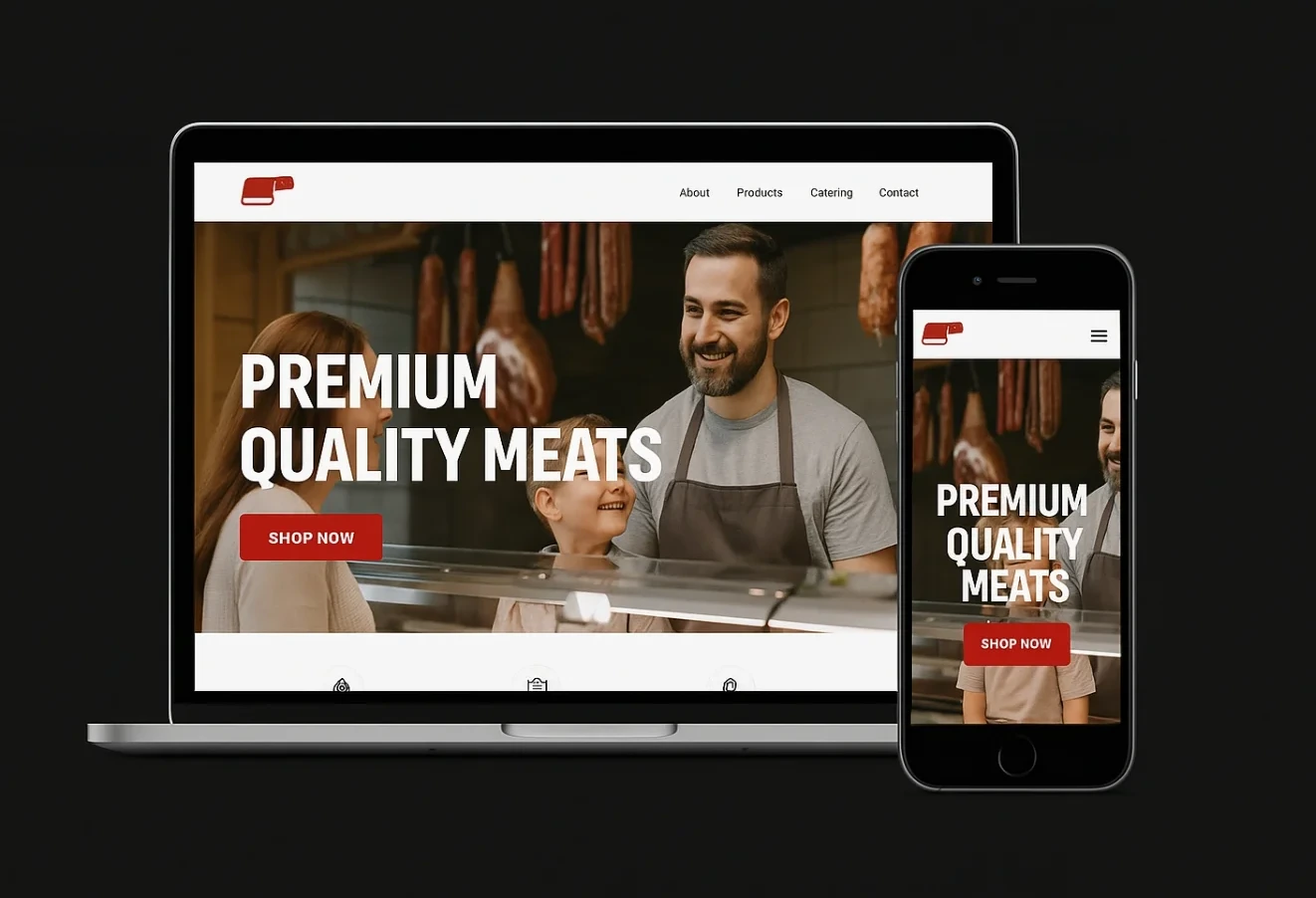
Butcher & Block had built a real neighbourhood following on the strength of its counter — dry-aged cuts, house-made sausage, a butcher who knows regulars by name. The website reflected none of the actual product: a hero photo, a Shop Now button that led to the same homepage, and nothing else.
Catering, which had grown into a meaningful part of revenue almost entirely by word of mouth, had no presence online at all. A customer wanting a backyard barbecue platter or a holiday roast had no way to see packages or get a quote without calling during counter hours, competing with the walk-in line for the owner's attention.
And for a shop with two things people actually search for — what's in stock, and where the shop is — the site answered neither.
The approach
Three moves, in order.
01
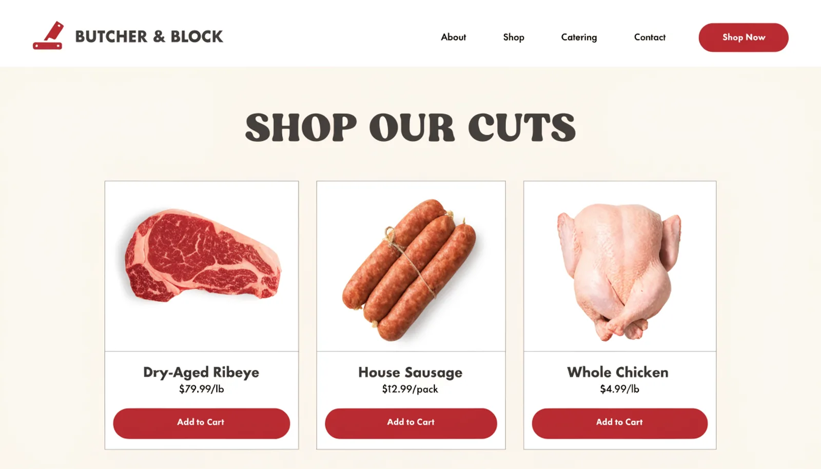
Put the cuts online, with prices
A shop page with real products — dry-aged ribeye, house sausage, whole chicken — replaced the single unclickable Shop Now button with something a customer can actually browse.
02
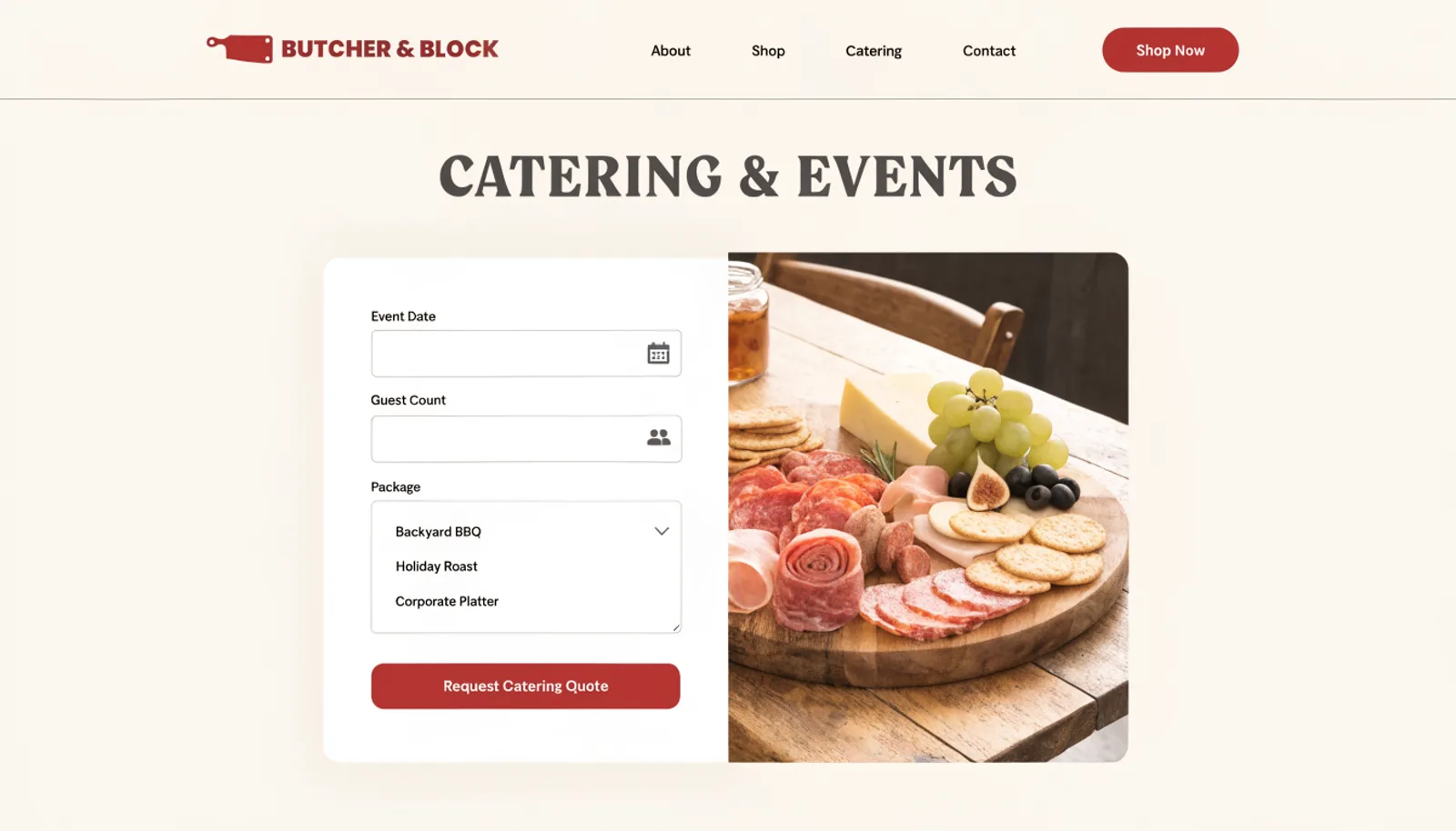
Turn catering into a bookable package
Backyard Barbecue, Holiday Roast and Corporate Platter packages each get a guest-count-based quote request, pulling catering out of word-of-mouth and onto the page where it belongs.
03
Answer where and when
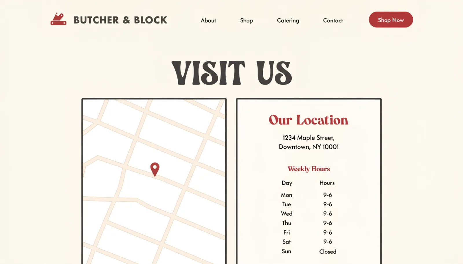
A simple map and hours table replaced the absent location information, the most basic thing a local shop's site needs to do well.
The work
What we built.
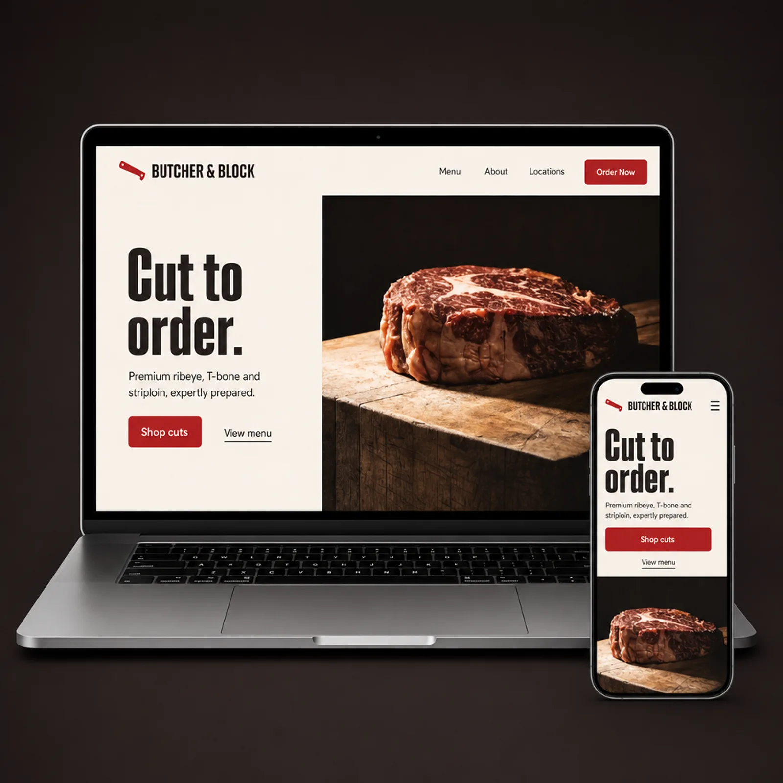
The new homepage
Also delivered
A weekly “what's in stock” note the owner can post from his phone, since availability changes with each animal broken down and customers were routinely showing up for cuts that had already sold out.
Results
First quarter on the new site.
+64%
Catering quote requests submitted online
+40%
Average catering order size
2.9×
Directions requests from the visit page
1
Shop Now button that finally shops
“Catering used to be whoever happened to ask at the counter. Now it comes in as a real request with a headcount and a package already picked, and it's become a business in its own right instead of a side favour.”
Samuel OkonkwoOwner, Butcher & Block
Figures are illustrative of the outcomes this engagement was designed to produce and are shown here for portfolio purposes.