Keystone Tutoring · Education
Booking a tutor shouldn't need a phone call
A parent looking for a tutor at 9pm, after homework has gone badly, wants to book something right then. Keystone's site asked them to call during school hours instead. We moved the whole decision — subject, time, price — onto the page.
The problem
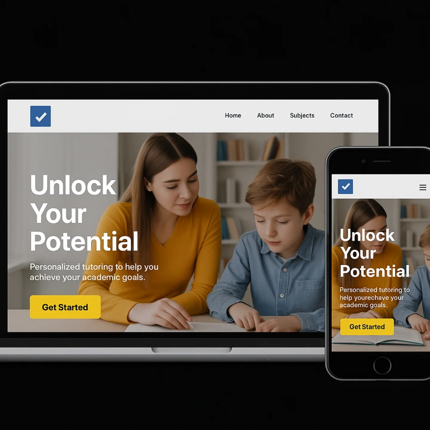
The moment a parent decides to look for a tutor is rarely convenient — it's after a bad test result, or a frustrating homework session, often in the evening. Keystone's site required calling during business hours to book anything, which meant that moment of motivation usually passed before the parent ever reached a person.
There was also no visibility into what subjects were even covered, or what a session cost, so a parent comparing tutoring options had to call multiple places just to get comparable information — friction that favoured whichever competitor made pricing easiest to find.
And there was no sense of availability. A parent needing a Tuesday-evening slot had no way to check whether one existed before going through the trouble of calling.
The approach
Three moves, in order.
01
List every subject, plainly
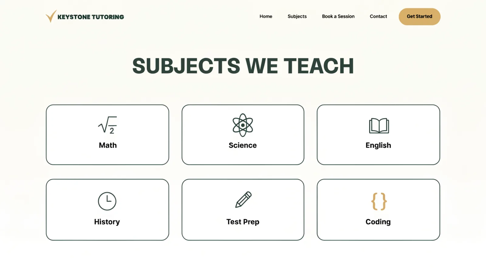
Math, Science, English, History, Test Prep and Coding are each their own subject card, so a parent finds the right fit in seconds instead of asking over the phone.
02
Show real availability at the point of booking
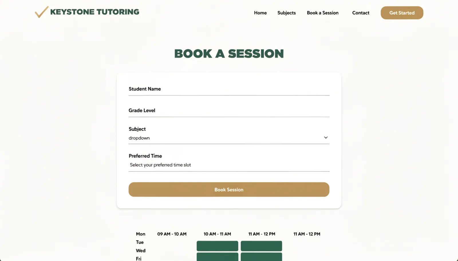
The booking form pairs a subject and time request with a visible weekly availability grid, so a parent can pick a slot that's actually open.
03
Make pricing visible before the first call
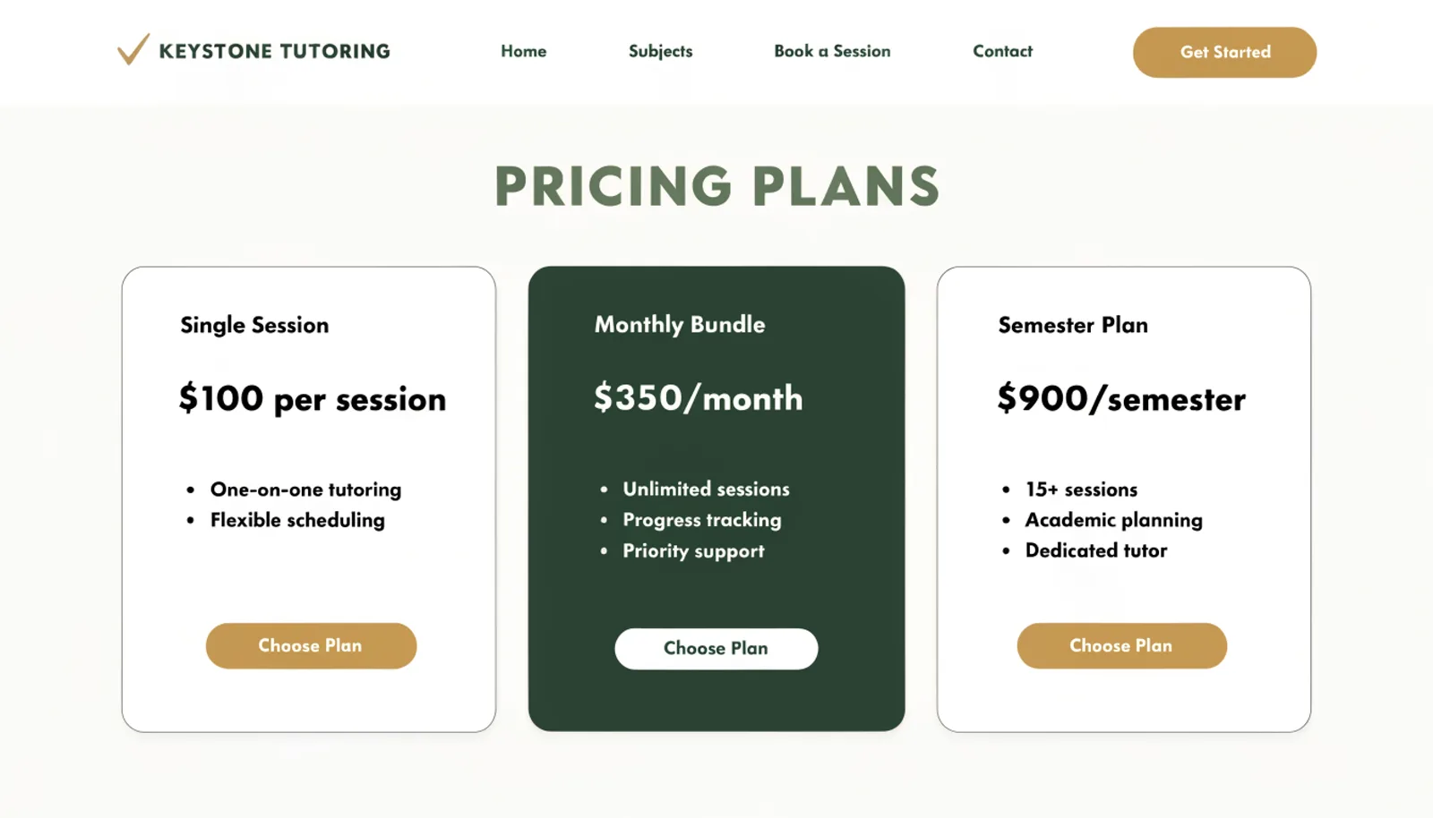
Single Session, Monthly Bundle and Semester Plan pricing tiers replaced a site with no prices anywhere, closing the comparison-shopping gap that was costing Keystone leads.
The work
What we built.
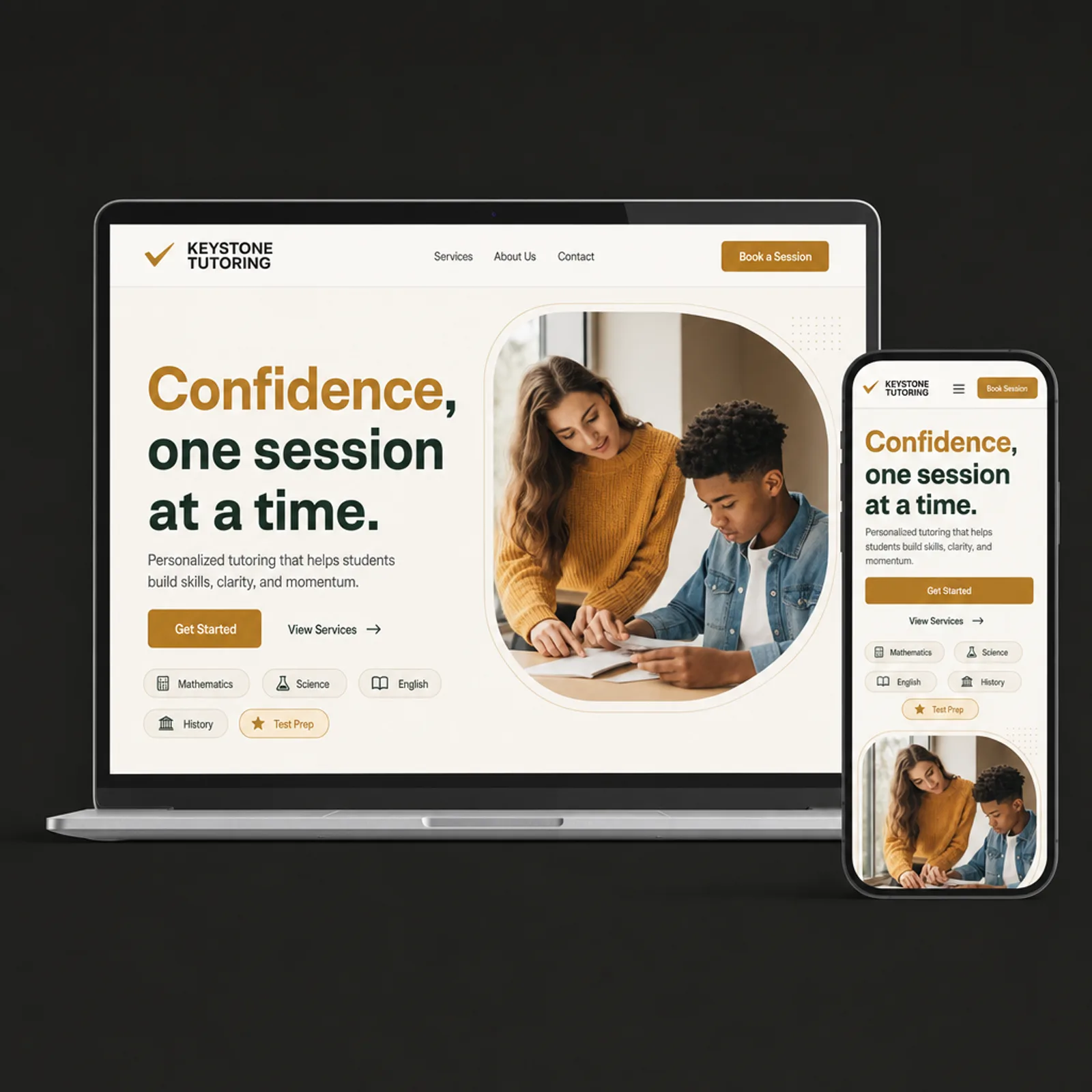
The new homepage
Also delivered
An automated confirmation and reminder email for every booked session, since a meaningful share of no-shows had been coming from bookings confirmed only by memory over the phone.
Results
First semester on the new site.
+81%
Sessions booked outside business hours
+37%
New families citing visible pricing as a factor
−26%
No-show rate after adding reminders
1
Site that finally answers “how much”
“The calls used to come in during the day, when we were teaching and couldn't answer, and go to voicemail. Now the bookings happen at night, right when a parent has actually decided they need us.”
Grace OkonjoFounder, Keystone Tutoring
Figures are illustrative of the outcomes this engagement was designed to produce and are shown here for portfolio purposes.