ND Studio · Beauty
A visual business with an unclickable gallery
ND Studio's entire pitch is the nail art itself — intricate, editorial, worth booking around. The old site had one photo and a Book Now button with no calendar behind it. We gave the work a gallery and the booking a real system.
The problem
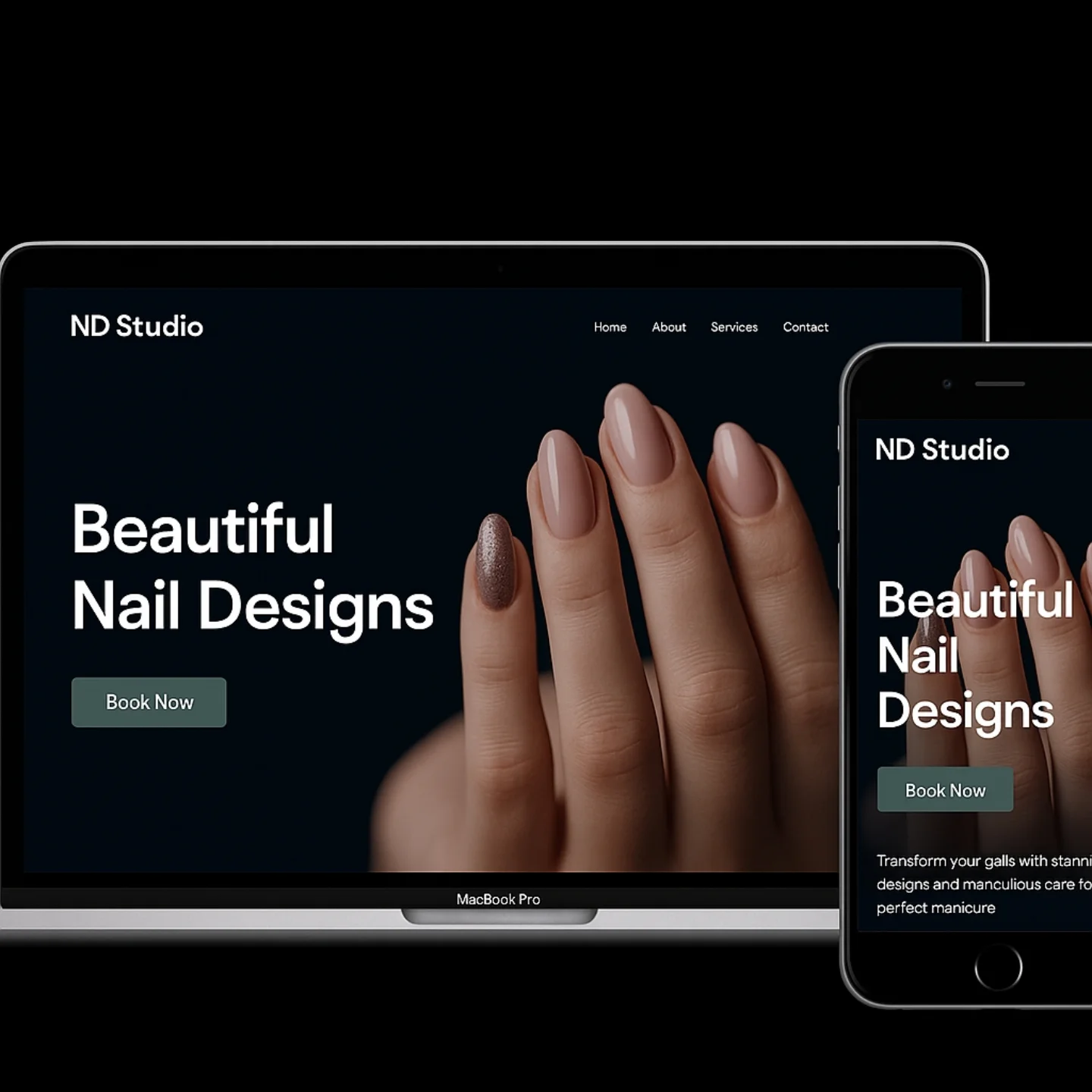
ND Studio's work is genuinely gallery-worthy — clients travel across the city for specific designs they've seen on Instagram. The studio's own website undersold that almost completely: a single dark, moody hero photo and a Book Now button that opened a static contact form with no calendar.
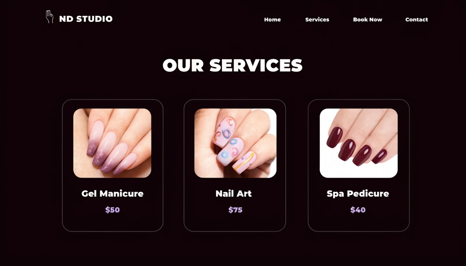
There was no pricing anywhere, which for a service with a wide range — a basic gel manicure versus intricate nail art — left new clients unsure what to expect to pay, a real source of hesitation before booking.
And there was no way to browse actual past work. For a visual service, that's the equivalent of a restaurant with no photos of the food — clients were being asked to trust the studio on reputation alone.
The approach
Three moves, in order.
01
Put real prices on real services
Gel Manicure, Nail Art and Spa Pedicure are now listed with actual prices, closing the guesswork that kept new clients hesitant to book.
02
Build a real booking flow
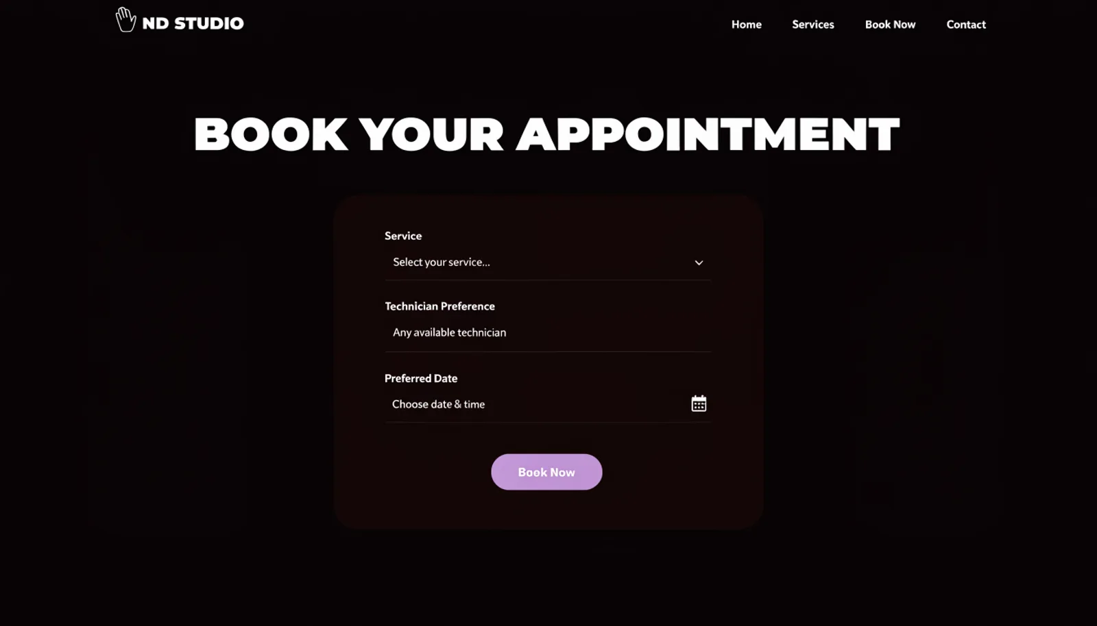
A form capturing service, technician preference and date replaced the static contact form, turning ‘Book Now’ into something that actually books.
03
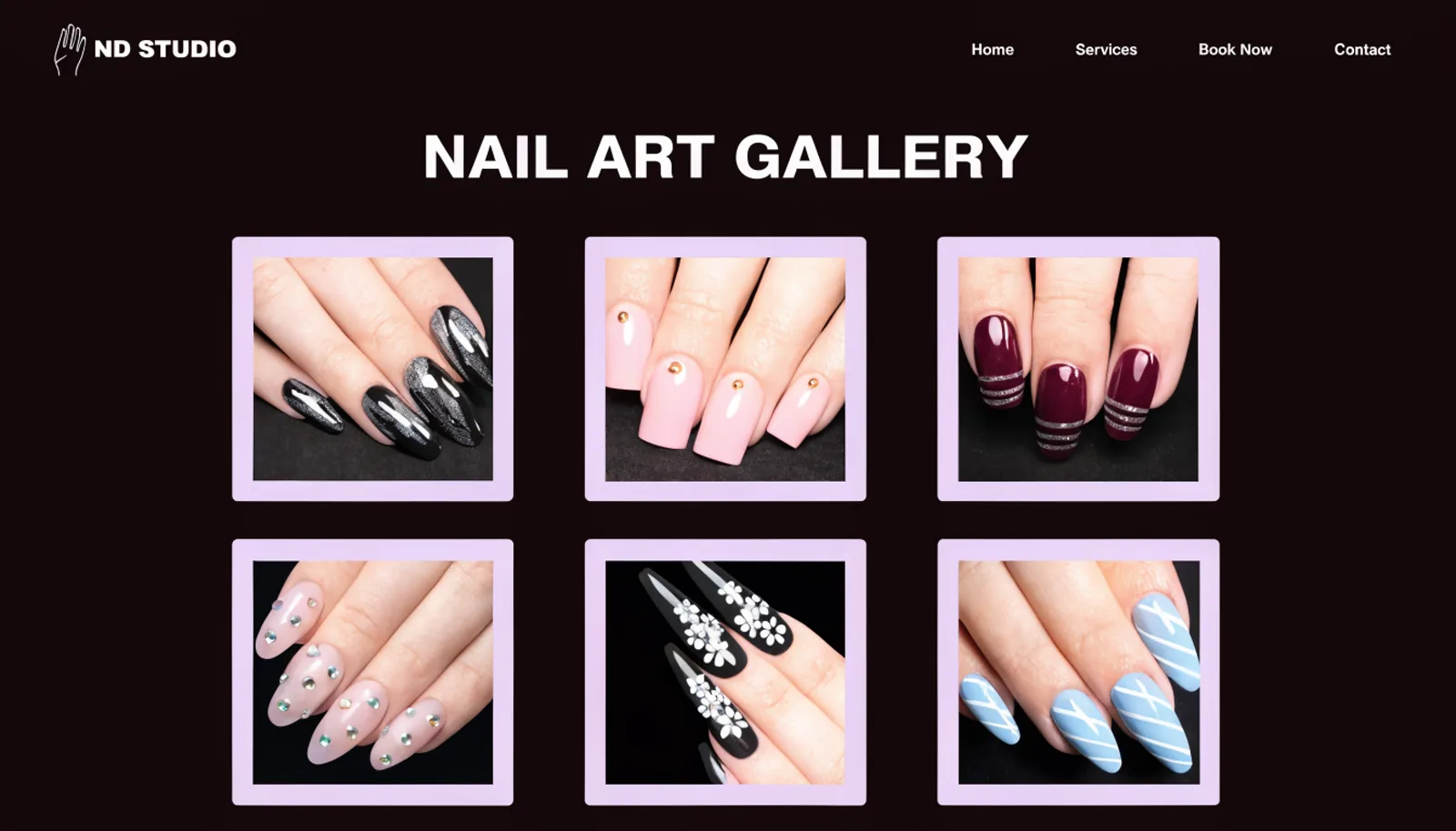
Give the work a gallery
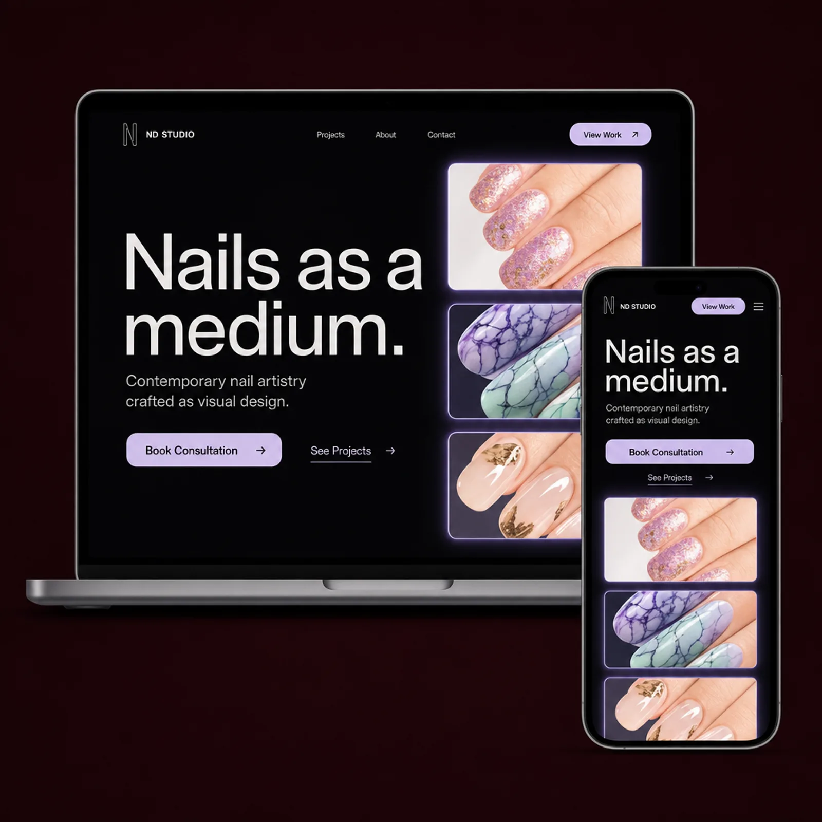
A dedicated nail art gallery lets clients browse actual past designs, the same way they already browse for inspiration on social media — just now on ND's own site.
The work
What we built.
The new homepage
Also delivered
A technician-tagging system on each gallery photo, so a client who falls in love with a specific design can request the artist who actually made it.
Results
First quarter on the new site.
+68%
Appointments booked online
3.5×
Gallery page views before booking
+24%
Average ticket size after listing prices
1
Book Now button that finally books
“Clients were finding our work on Instagram and then hitting a wall trying to actually book with us. Now the gallery and the booking live in the same place, and people request specific designs by name.”
Noelle DuarteOwner, ND Studio
Figures are illustrative of the outcomes this engagement was designed to produce and are shown here for portfolio purposes.