Copper Plumbing · Home Services · Concept
A plumber that looks like the work, not the van
Every plumbing site in Calgary is the same blue van, the same thumbs-up stock photo and the same coupon. Copper Plumbing wanted to be hired for its workmanship, so we built the site around the material itself: dark, warm and unhurried, with the phone number never more than one tap away.
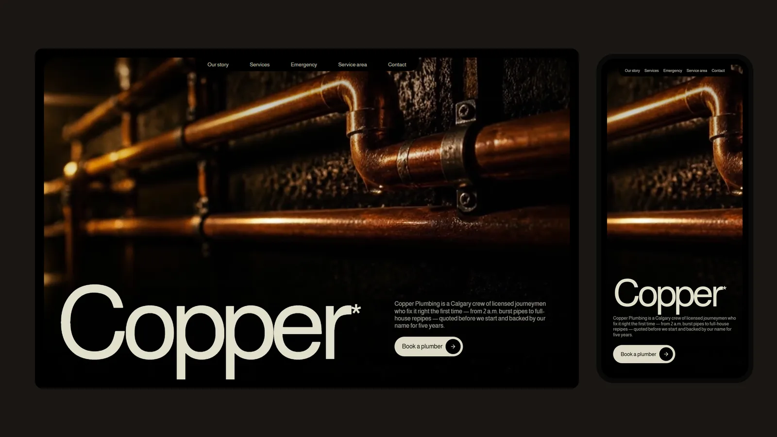
The problem
Search for a plumber in Calgary and the first page of results looks like one site copied twenty times: primary blue, a smiling model in a clean polo, a coupon for $49 off, and a phone number in a red banner. When every company looks the same, the only thing left to compete on is price.
Copper Plumbing is not the cheapest crew in the city and does not want to be. It is a small team of licensed journeymen known for sweated copper repipes and water-heater work, and its customers find it through referrals. The site's job is to confirm what a neighbour has already told them: these are the careful ones.
Urgency still matters. Someone with water on the basement floor at 2 a.m. does not care about art direction. The design had to look considered without ever putting anything between a panicked homeowner and the phone.
The approach
Three moves, in order.
01
Let the material be the brand
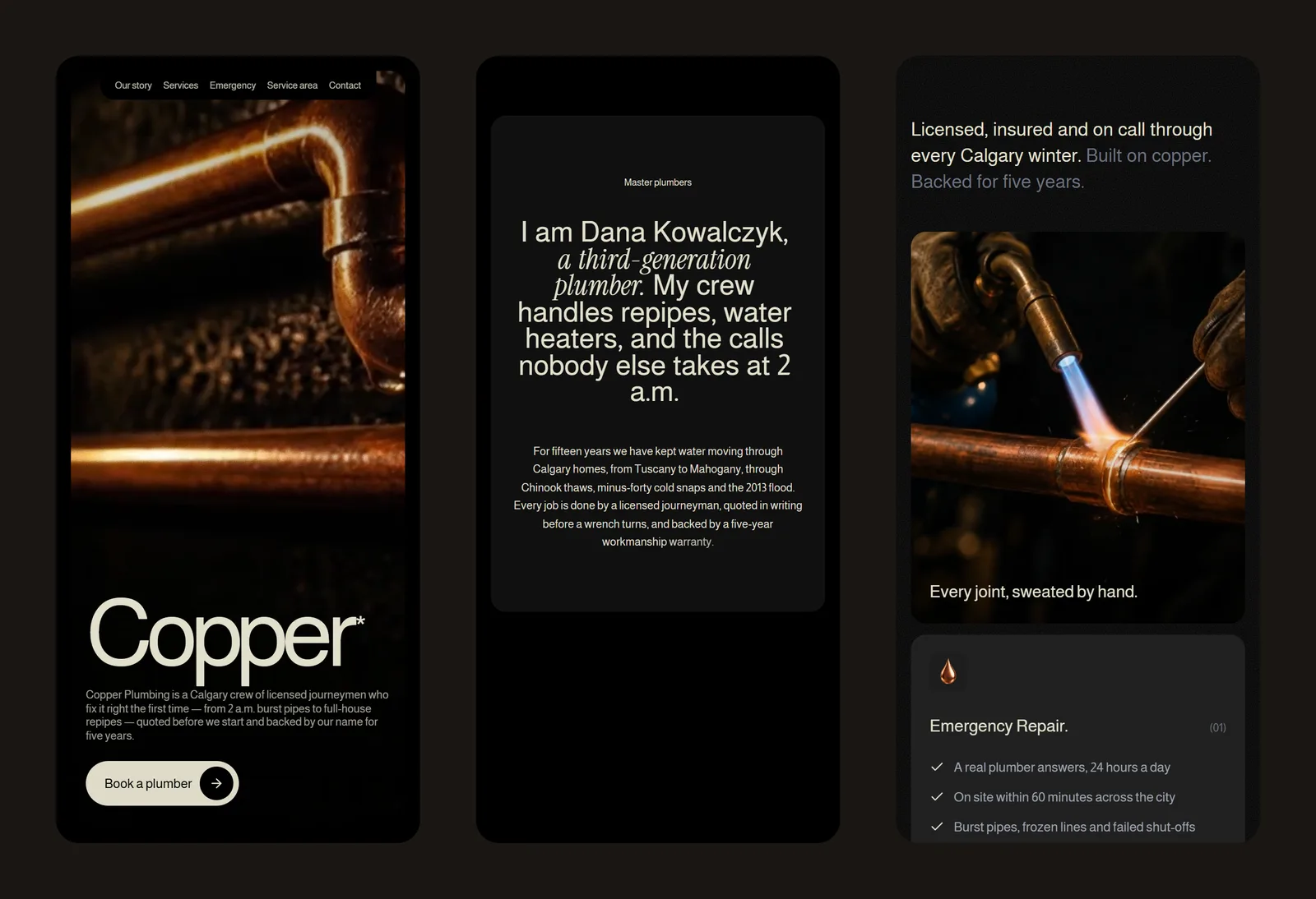
The palette comes from the pipe: near-black grounds, warm cream type and copper highlights. The hero is a slow film of copper runs on a basement wall, and a droplet forming at a joint does the storytelling that a headline usually does.
02
Say it in one word
The name is set at twenty percent of the viewport width and pulls up word by word. A small asterisk, which the rest of the page never explains, gives it the feel of an editorial masthead rather than a franchise sign.
03
Keep the phone one tap away
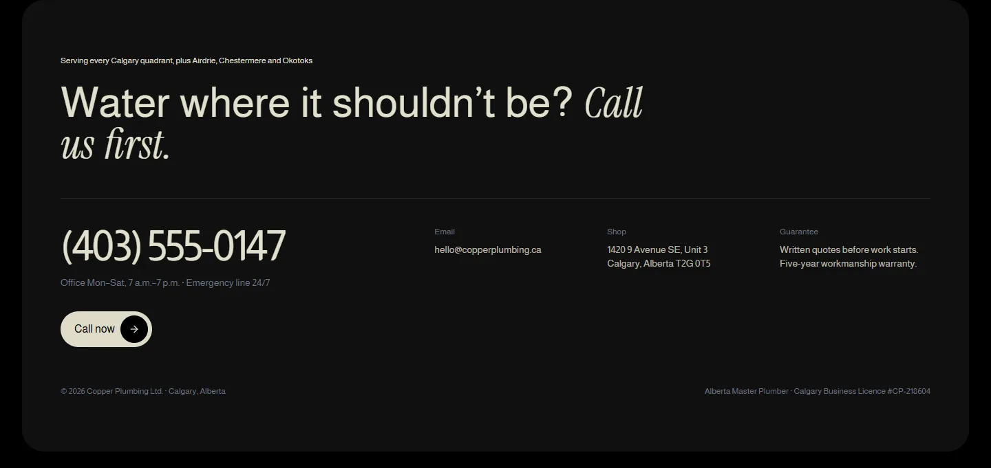
The primary button in the hero dials the shop. The services grid leads with emergency repair, and the footer sets the number at display size, above the email and address, with the 24/7 line stated plainly.
The work
What we built.
The homepage
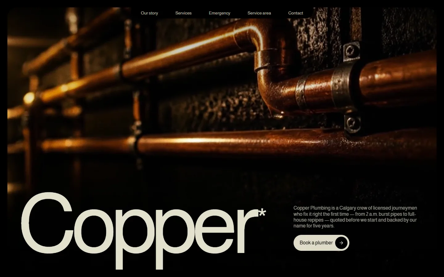
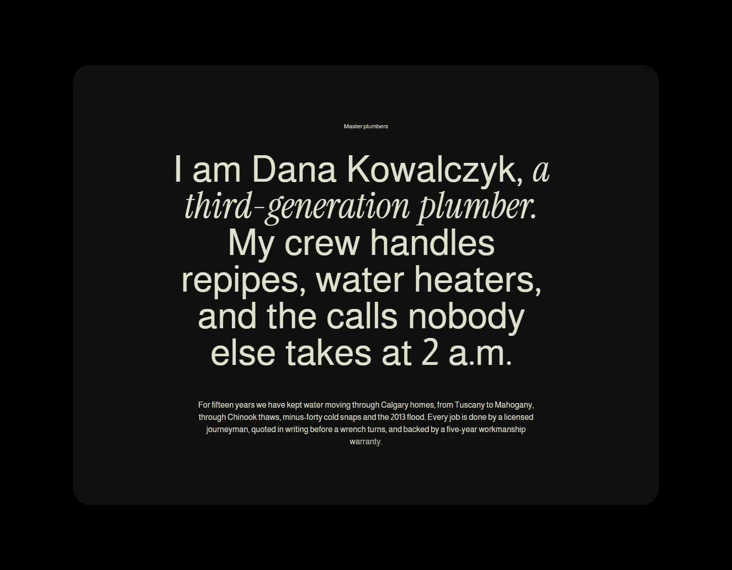
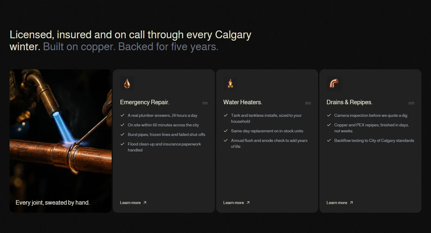
Contact and coverage
On a phone
Also delivered
Both films and all three icons were generated for the project from written art direction: a still image first, then animated into a silent loop so the colour and composition were settled before any motion. The films are under a megabyte combined and loop without sound.
Business details live in one content file, so the phone number, licence line and service area change in one place. Open the live page →
Results
What the build has to hit.
1 tap
From any section to dialling the shop
<1 MB
Both background films combined
0
Stock photos of plumbers
3
Breakpoints designed, not just scaled
Copper Plumbing is a concept project. The company, owner and contact details are fictional, and the figures above are design targets rather than measured results.