Penspy Security · Cyber Security & Audit · Concept
A security firm that looks like it has nothing to hide
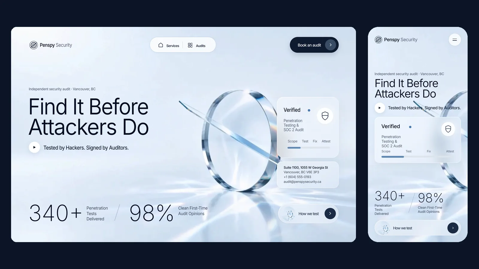
Cyber security sites sell fear: black backgrounds, green code, a hooded figure. Penspy Security is an independent auditor, so it needs to be trusted more than it needs to scare anyone. We built a single bright, glass-clear hero where every claim sits in plain sight.
The problem
Search for cyber security in Vancouver and the results are all versions of one look: a black page, a padlock made of circuit lines, and a stock photo of someone in a hoodie at a laptop. The pitch underneath is fear, meaning breaches, ransom and fines, followed by a demo form.
Penspy sells to controllers, CFOs and compliance leads who have been told they need a SOC 2 report or a penetration test before they can close a customer. They do not need to be frightened. They need to believe that whoever signs the report will say what they found, even if it's bad news for the client.
The firm also does two jobs that usually live in separate companies: offensive testing and independent audit. The site had to hold both without reading like two businesses stitched together.
The approach
Three moves, in order.
01
Light the room, don't darken it
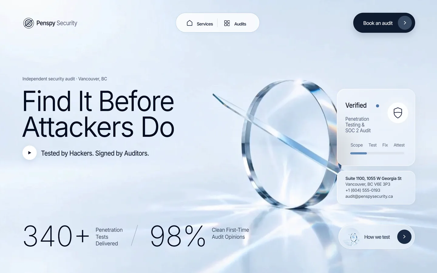
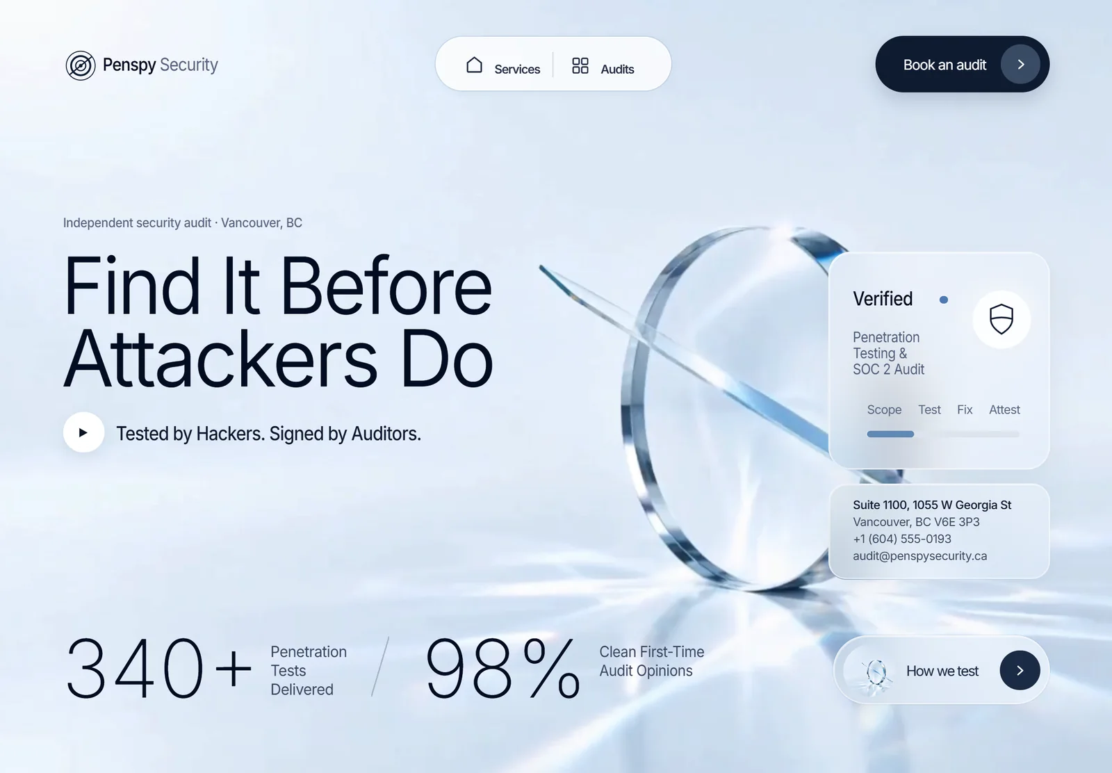
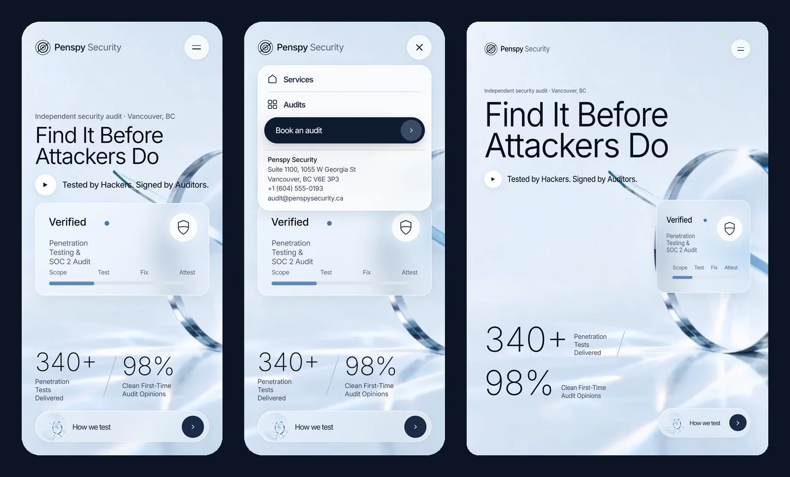
The whole palette is a pale studio blue. A slow film of a glass lens with a thin glass blade through it gives two ideas one image: the auditor looks through, and the tester cuts in. Only the light moves across the floor. Nothing on the page flashes or glitches.
02
Put the method in the proof panel
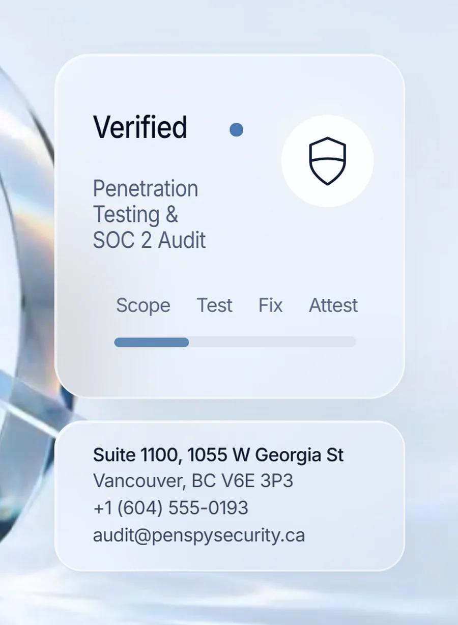
The frosted card shows Penspy's engagement as four named stages (scope, test, fix, attest) with a meter drawn across them, instead of an animated threat map. It tells a buyer what they are paying for before they ask.
03
Measure every pixel against one comp
Every size on the page is a multiple of one design unit, measured from a 1280 × 960 comp. The film stretches to fill any screen while type and glass keep their proportions. Three layout tiers are chosen by the frame's shape rather than by device name, so a rotated phone gets its own composition.
The work
What we built.
The homepage
On a phone
Also delivered
The background film was generated for the project from written art direction: the still came first so the lens, the blade and the light were fixed before any motion, then it was animated into a silent ten-second loop whose last frame matches its first. Anyone who has asked their device for reduced motion gets the first frame, held still.
The page is one HTML file with no framework and no build step. The entrance animation adds its starting states before the first paint and removes them when it finishes, so without JavaScript the page simply renders complete. Open the live page →
Results
What the build has to hit.
1 file
HTML, CSS and JS, no framework
1.4 MB
Ten-second background film
0
Hooded hackers or green code
3
Layout tiers, chosen by screen shape
Penspy Security is a concept project. The company, address, phone number and email are fictional, and the figures on the page (340+ tests, 98%) are placeholder copy rather than claims.