Vitaforge Daily · Health & Wellness App · Concept
A wellness check-in that feels like breathing out
Most wellness apps open with a form: sliders, dropdowns, a progress bar that says step 1 of 12. Vitaforge Daily asks one question a day. We designed the onboarding quiz screen so that answering it takes three taps and a swipe, and feels calm while you do it.
The problem
Wellness apps tend to onboard like insurance companies. The first screen asks for age, height and weight, the second a list of goals in a checkbox column, and a progress bar keeps count. People who downloaded the app to feel less stressed get a questionnaire before they get anything back.
Vitaforge Daily's pitch is a short daily check-in, not a full health profile. The first screen had to show that straight away: one question, a handful of answers big enough to tap without aiming, and a way to answer out loud for anyone who would rather not tap at all.
It also had to look like it belongs on a current phone. Frosted, translucent surfaces are now the default look of the operating system, and an app that ignores them looks older than it is.
The approach
Three moves, in order.
01
Put the calm in the background
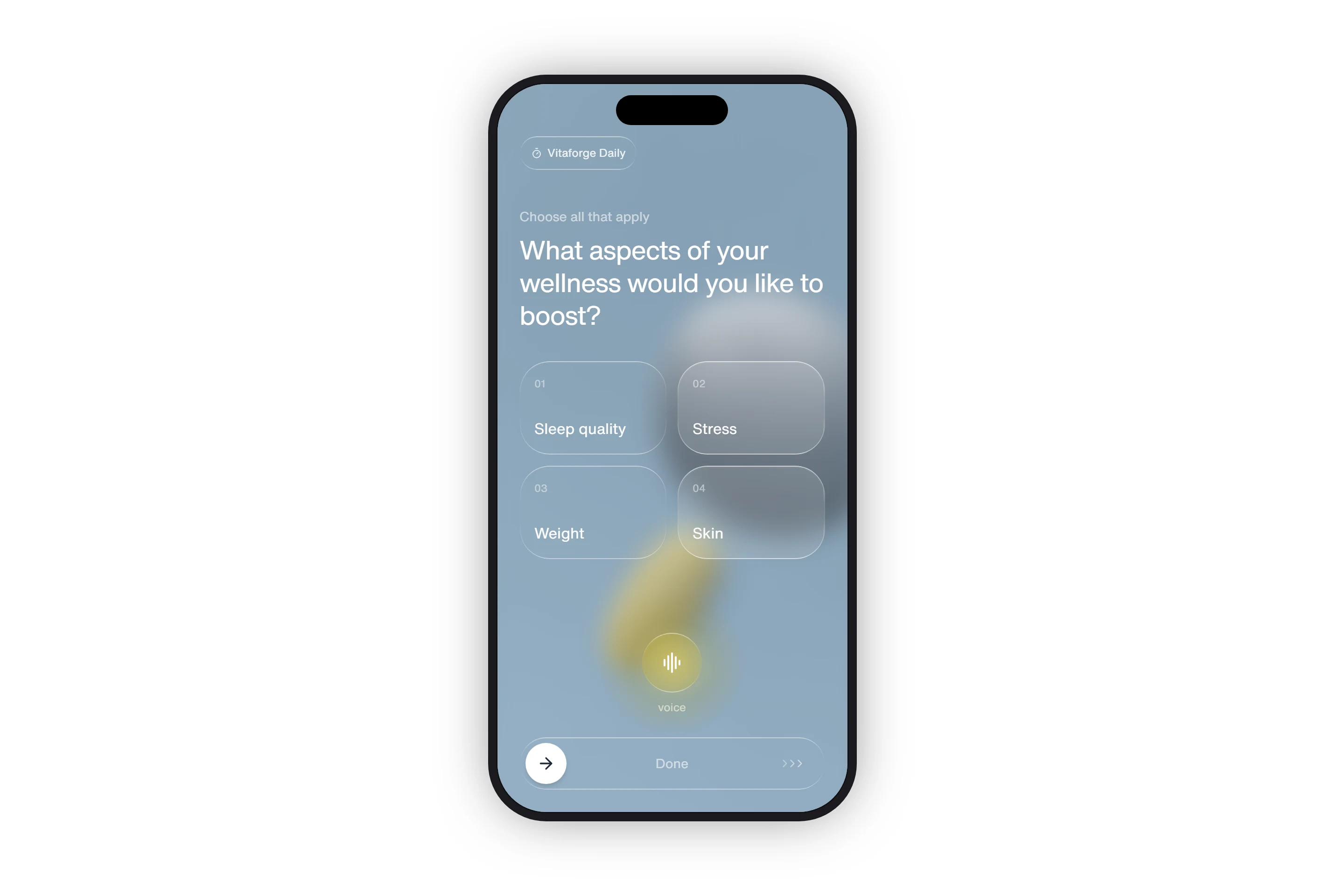
The screen sits on a photograph that is blurred until it is only colour and soft shapes, with a cool grey-blue wash over it. Nothing competes with the question. The only warm colour on the screen is a gold glow behind the voice button, so that is where the eye goes once the cards are read.
02
Make every surface the same glass
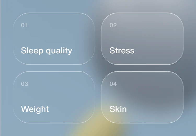
The badge, the cards, the voice button and the slider track all share one liquid-glass style: nearly clear, lightly blurred, with a hairline border that brightens at the top and bottom edges like light catching a lens. A selected card is the same glass, just slightly frosted and a little brighter, so the selection reads without any tick marks or accent colour.
03
Replace the Submit button with a gesture
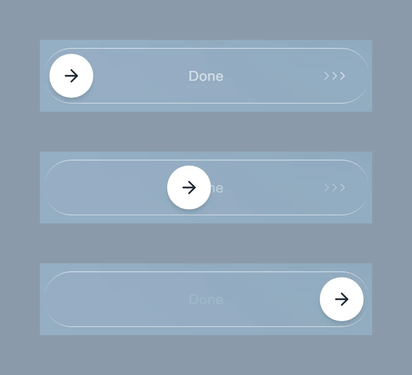
A Next button gets tapped by mistake. A slider has to be dragged on purpose. The thumb follows your finger, the Done label and chevrons fade as it moves, and on release it either snaps to the end (past 85% of the track) or springs back to the start. Keyboard users can press Enter on the thumb to finish.
The work
What we built.
The screen
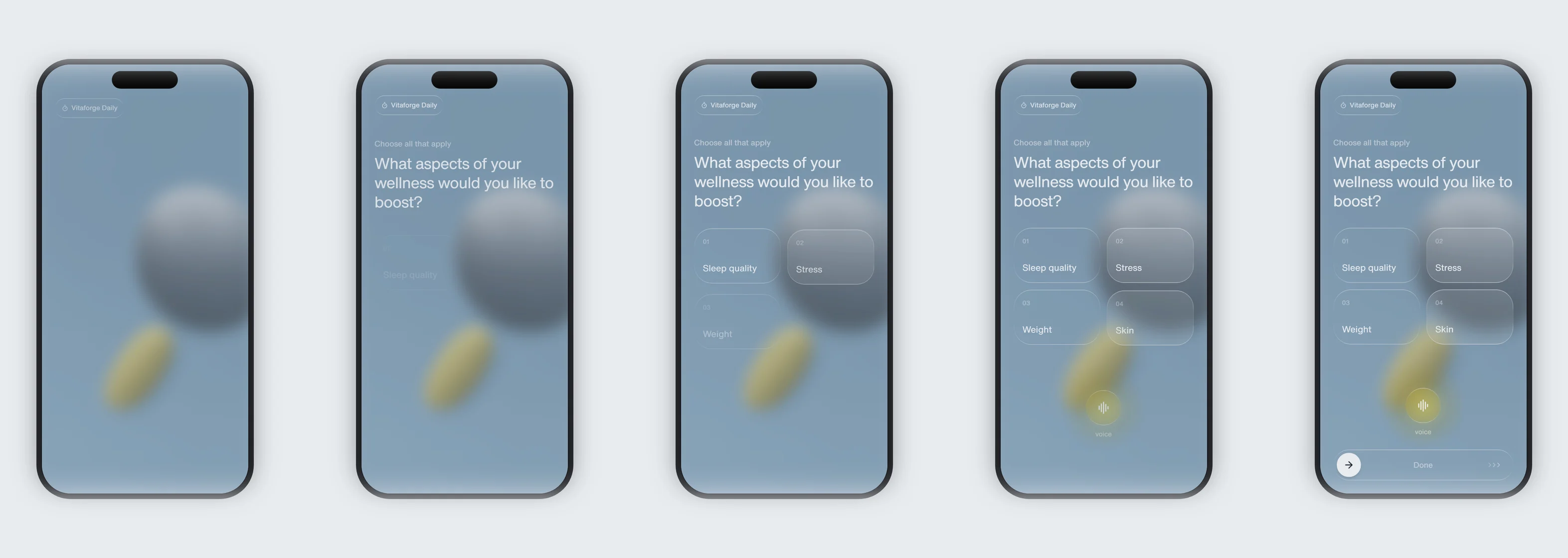
The entrance
Also delivered
The screen is built in React 18 and TypeScript with Tailwind CSS 3 and Lucide icons, bundled by Vite. The glass effect is two small CSS classes: the gradient hairline is a pseudo-element masked down to a 1.4px ring, so it follows any corner radius without an extra element. The drag uses pointer events with pointer capture, so it behaves the same with a mouse, a finger or a stylus.
The production build inlines all of its script and styles into a single 161 KB HTML file (52 KB compressed) that opens straight from disk. The full project source ships alongside it. Open the live screen →
Results
What the build has to hit.
1 file
The whole screen, inlined, opens from disk
52 KB
Compressed size of the production build
1
Glass style, used on every surface
85%
How far you drag before Done commits
Vitaforge Daily is a concept project. The app, its name and its features are fictional, and the screen shown is an interactive prototype of one onboarding step rather than a shipped product. The background photograph is loaded from an external image host.