Drift · Productivity App · Concept
A planner for people who hate planners
Productivity apps market themselves with dashboards: twelve widgets, a streak counter and a colour-coded calendar in the hero shot. For someone with ADHD, that screenshot is the problem. Drift's landing page sells the opposite: less on screen, one thing at a time, and a pace that never rushes the visitor.
The problem
The planner category sells capability. The standard landing page opens on a laptop mockup packed with boards, tags, timers and integrations, then lists forty features in a grid. To most buyers that reads as power. To someone who has already abandoned three planners, it reads as another system to maintain.
Drift is built for that second person. Its promise is that it does less on purpose: fewer choices on screen, gentle prompts instead of red badges, one task held in focus while everything else fades. The site had to show that restraint rather than claim it.
It also had to avoid the other cliché, the soft-pastel wellness look that makes a tool seem too flimsy to rely on. Calm, but not vague.
The approach
Three moves, in order.
01
Lead with a feeling, not a feature grid
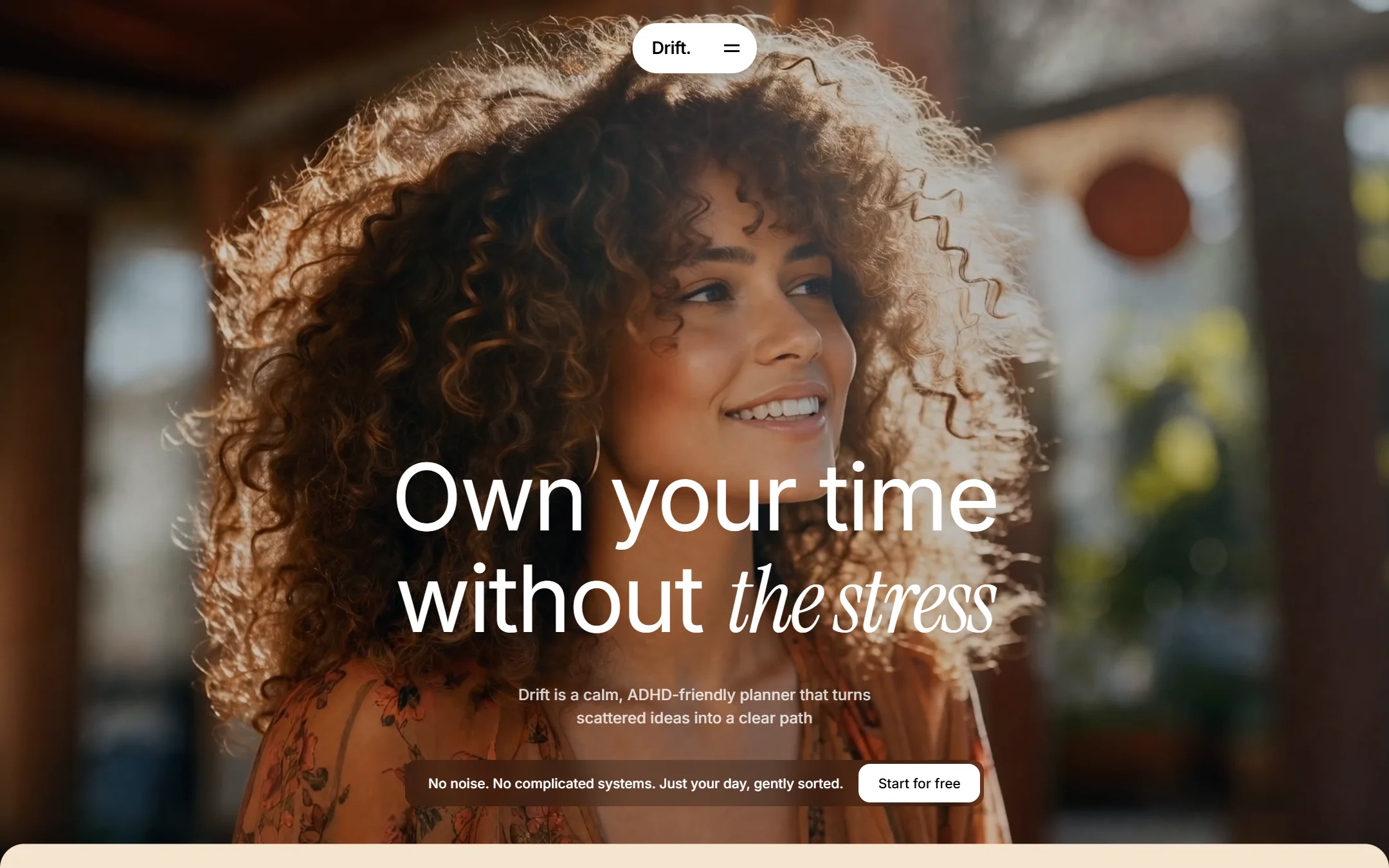
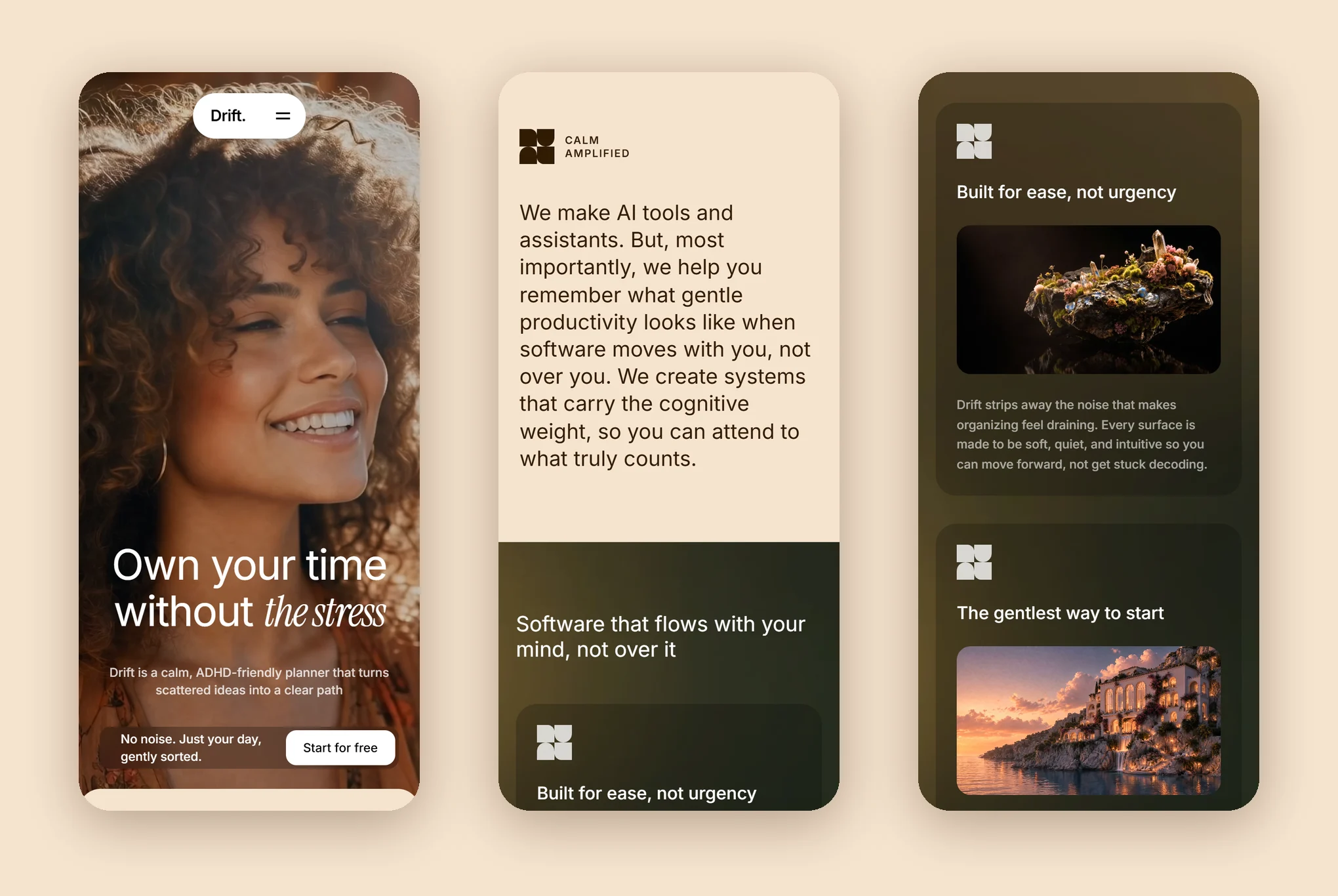
The hero is a full-screen film of one person in warm light, with a thin dark wash for legibility. Two lines of type sit at the bottom: Own your time, then without the stress, where the last two words switch from Inter to an Instrument Serif italic. That one change of voice is the only flourish on the page.
02
Keep the navigation small and quiet
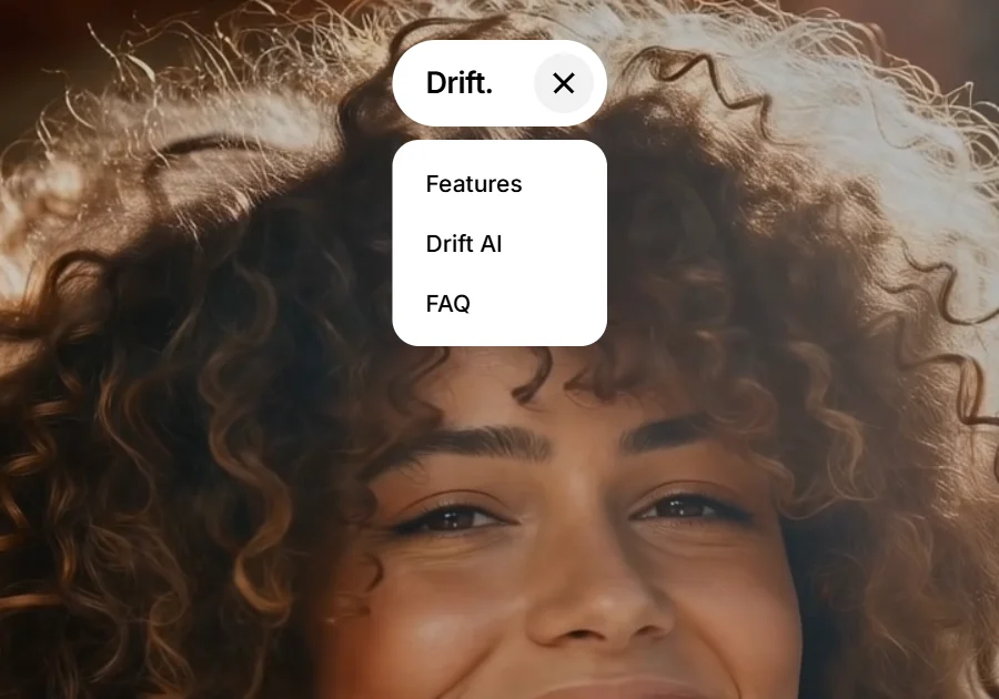
The whole navigation is one white pill at the top centre: the wordmark and a two-line menu icon. Tapping it turns the lines into an X and drops three links below. There's no mega-menu and no row of links to scan, so the visitor has one fewer decision to make.
03
Show one feature at a time
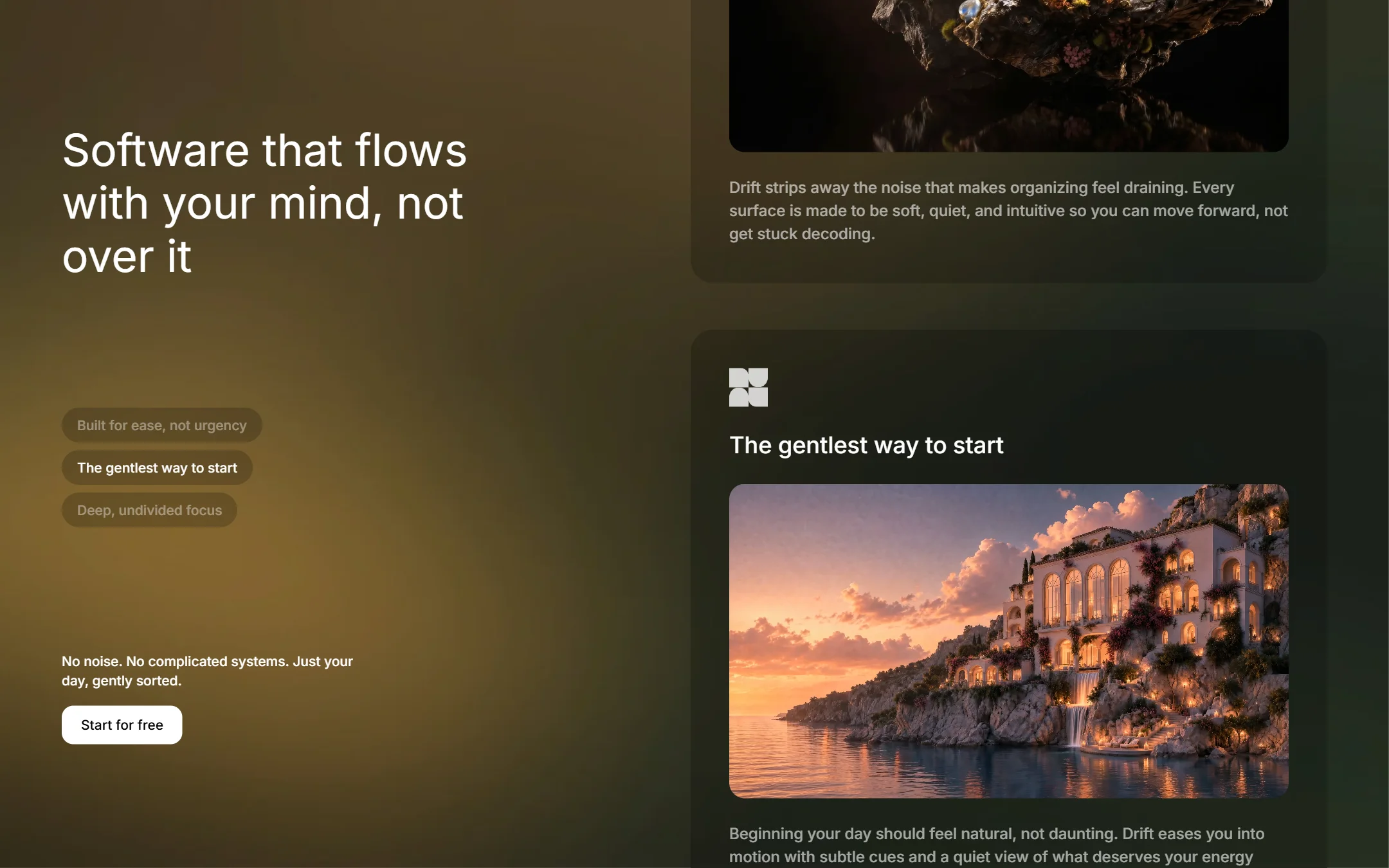
The features section pins the headline and a short index on the left while three cards scroll past on the right, each sliding in once as it arrives. The index shows which card is in view and jumps to any of them. Each card has one title, one short film and two sentences, which is the same pacing the app promises.
The work
What we built.
The hero
The features
On a phone
Also delivered
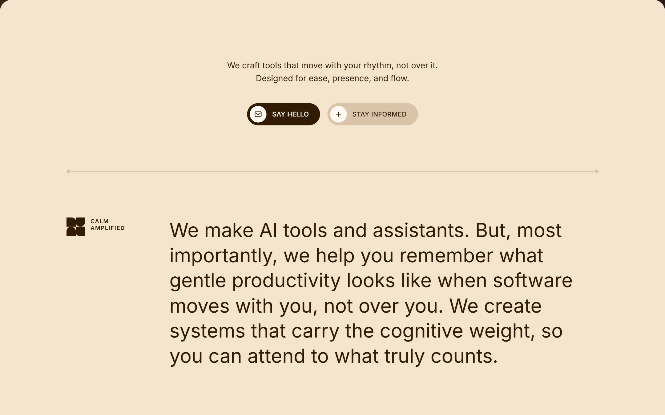
The logo is a single SVG path: four rounded quadrants that don't quite line up, a square that has loosened. It's drawn in dark brown on the cream section and in 80% white on the feature cards, so one file serves both.
The site is built in React 18 and TypeScript with Tailwind CSS 3 and Lucide icons, bundled by Vite into one 172 KB HTML file (54 KB compressed). The four films stream from a CDN rather than sitting in the bundle. The full source ships alongside the build. Open the live site →
Results
What the build has to hit.
3
Links in the entire navigation
3
Features shown, one at a time
54 KB
Compressed size of the site, films excluded
0
Dashboards in the hero
Drift is a concept project. The app, its name and its features are fictional. The hero and feature films and the section background are generated media loaded from an external host.