Urbanetics · Senior Living Property Tech · Concept
Four products, one front door
Urbanetics sells senior living operators four tools: a website manager, a sales pipeline, a resident app and a digital display manager. The buyers are executive directors who run buildings full of people, not software. The site had to make four products feel like one decision.
The problem
Senior living software is usually sold as a stack of separate logins. The website comes from an agency, the sales CRM from a real-estate vendor, resident messaging from a third app, and the lobby TV runs a USB stick someone updates on Mondays. Each vendor has its own landing page, and each one opens on a dashboard.
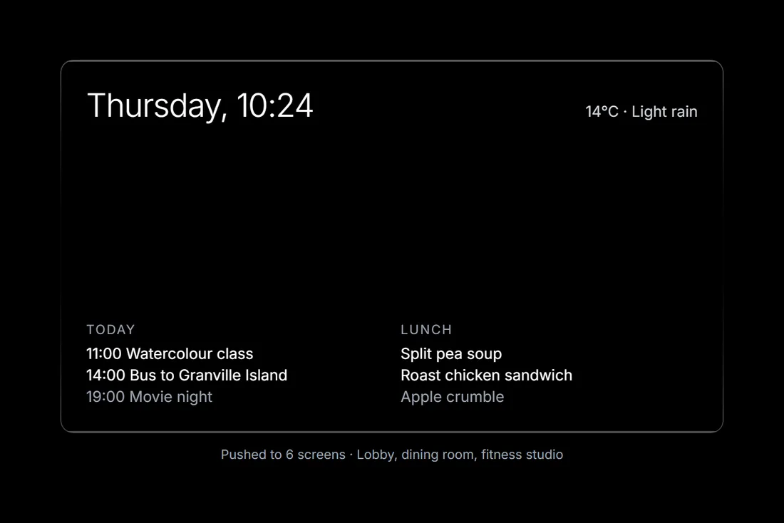
Urbanetics built all four and connected them: one calendar, one resident list, one login. The trouble was explaining that without a feature grid of forty checkmarks. The people who sign are executive directors and regional operators. They care about occupancy, about families who call the front desk, and about the Tuesday exercise class showing up on the lobby screen at the right time.
The brand also had to avoid both clichés of the category: the beige, soft-focus retirement brochure, and the cold enterprise dashboard. Urbanetics is a Vancouver tech company selling to people who look after other people. The site needed to feel modern and calm at once.
The approach
Three moves, in order.
01
Open on a place, not a product
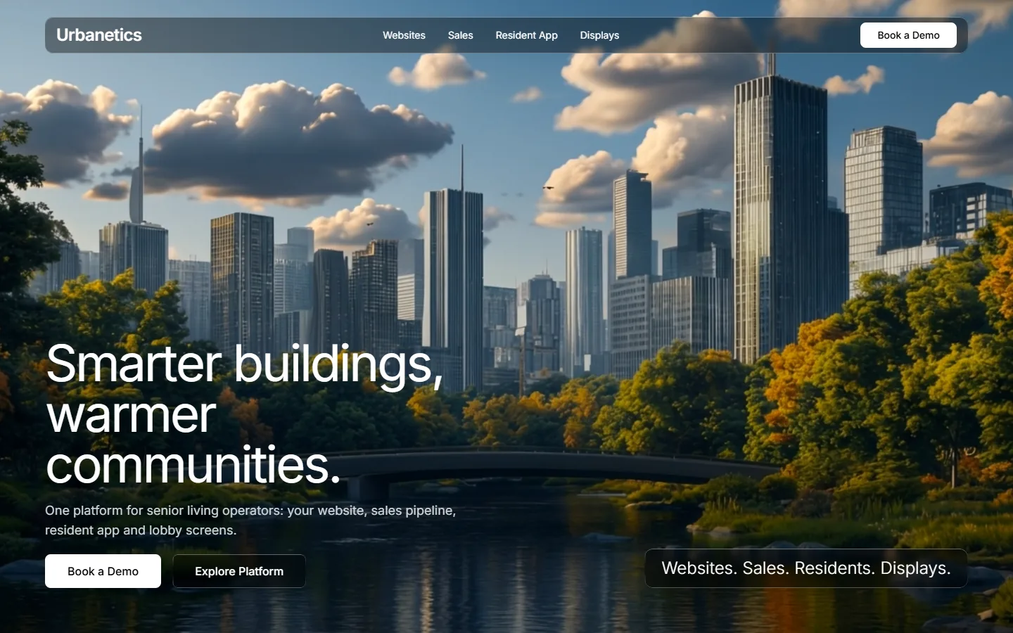
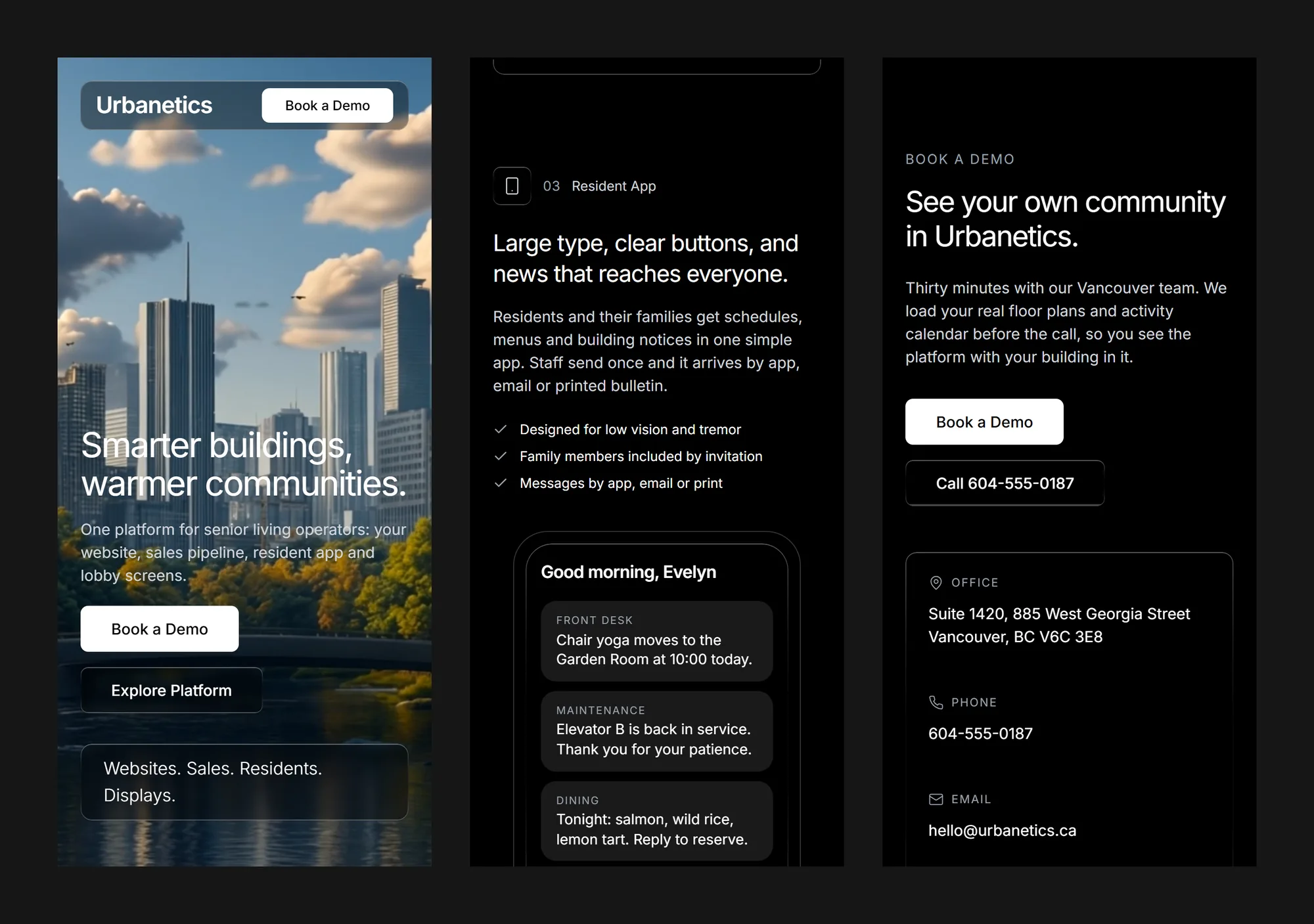
The hero is a full-screen film of a city skyline behind a park and a river, with no dark wash over it. The headline Smarter buildings, warmer communities arrives one character at a time, 30 ms apart, each letter sliding in from the left. The subhead, the two buttons and a glass tag reading Websites. Sales. Residents. Displays. fade in behind it in that order, so the four products are named before anyone scrolls.
02
One material for every surface
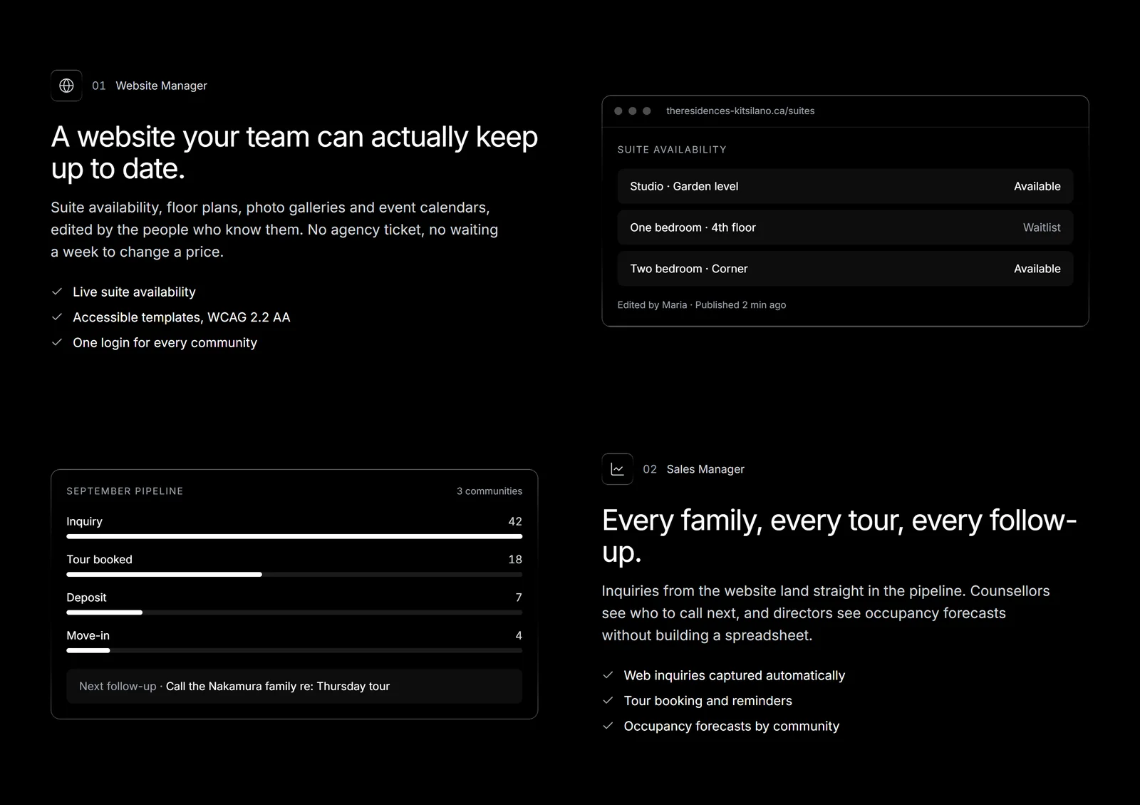
Every interactive surface, from the navigation bar and secondary button to the product mockups and contact card, uses the same liquid-glass treatment: a 40% black fill, a 4 px blur, and a gradient edge that catches light at the top and bottom. The palette is black, white and one grey. With nothing competing, the film and the four products carry the colour.
03
Show the product with real days in it
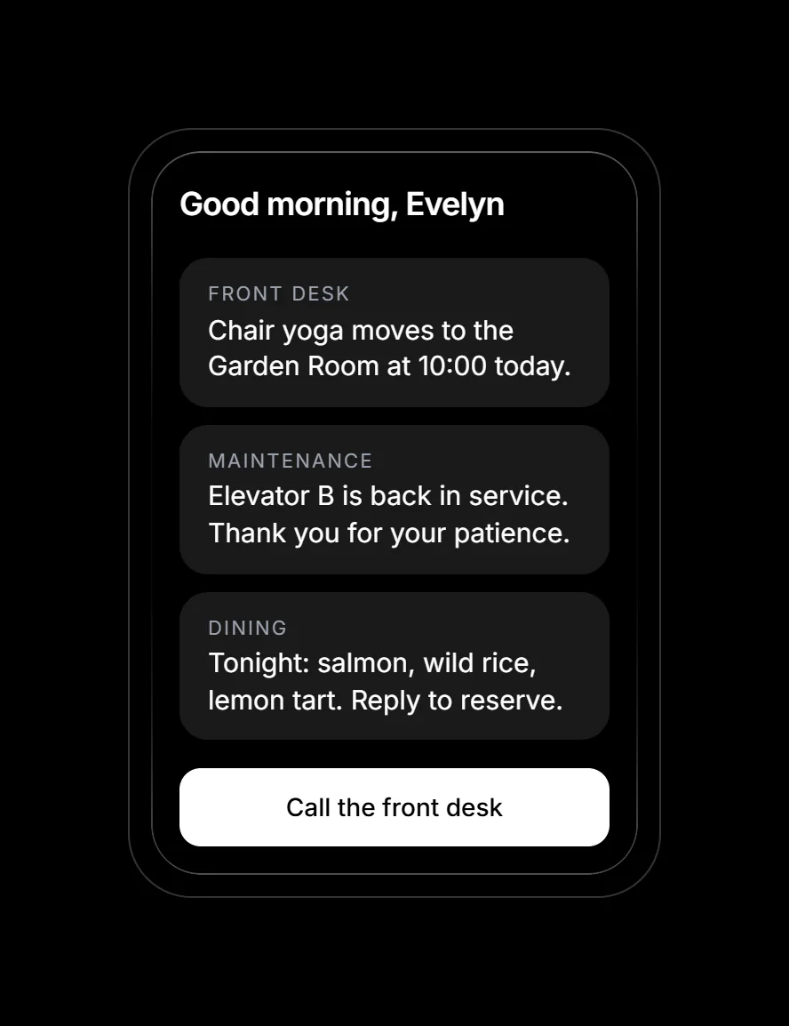
Each of the four products gets one panel: a plain-language headline, three checkmarks, and a mockup built in HTML rather than a screenshot. The mockups are filled with real-sounding days, like chair yoga moving to the Garden Room, Elevator B back in service, or a Thursday tour with the Nakamura family. A director should recognise their own Tuesday.
The work
What we built.
The hero
In motion
The platform
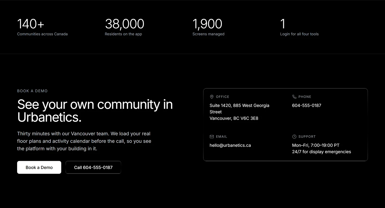
Book a demo
On a phone
Also delivered
The headline animation is a small React component. It splits the text into lines, the lines into words, and the words into characters, then staggers each character's fade and slide by 30 ms after a 200 ms pause. Words are kept whole so a narrow screen never breaks communities across two lines. Screen readers get the plain sentence through an aria-label.
The site is built in React 18 and TypeScript with Tailwind CSS 3 and Lucide icons, bundled by Vite into one 177 KB HTML file (56 KB compressed). Inter is loaded from Google Fonts, and the hero film streams from a CDN. The full source ships alongside the build. Open the live site →
Results
What the build has to hit.
4
Products, one page, one login
0
Overlays dimming the hero film
56 KB
Compressed size of the site, film excluded
1
Accent colour: white
Urbanetics is a concept project. The company, its contact details, its figures and its customers are fictional. The hero film and the suite viewer film are generated media loaded from an external host.