After Hours Café · Food & Beverage
A café that never mentioned what makes it different
After Hours Café's whole identity is right there in the name — open when every other coffee shop in the neighbourhood has closed. Their website never said so. We gave the café a homepage that finally leads with its actual advantage.
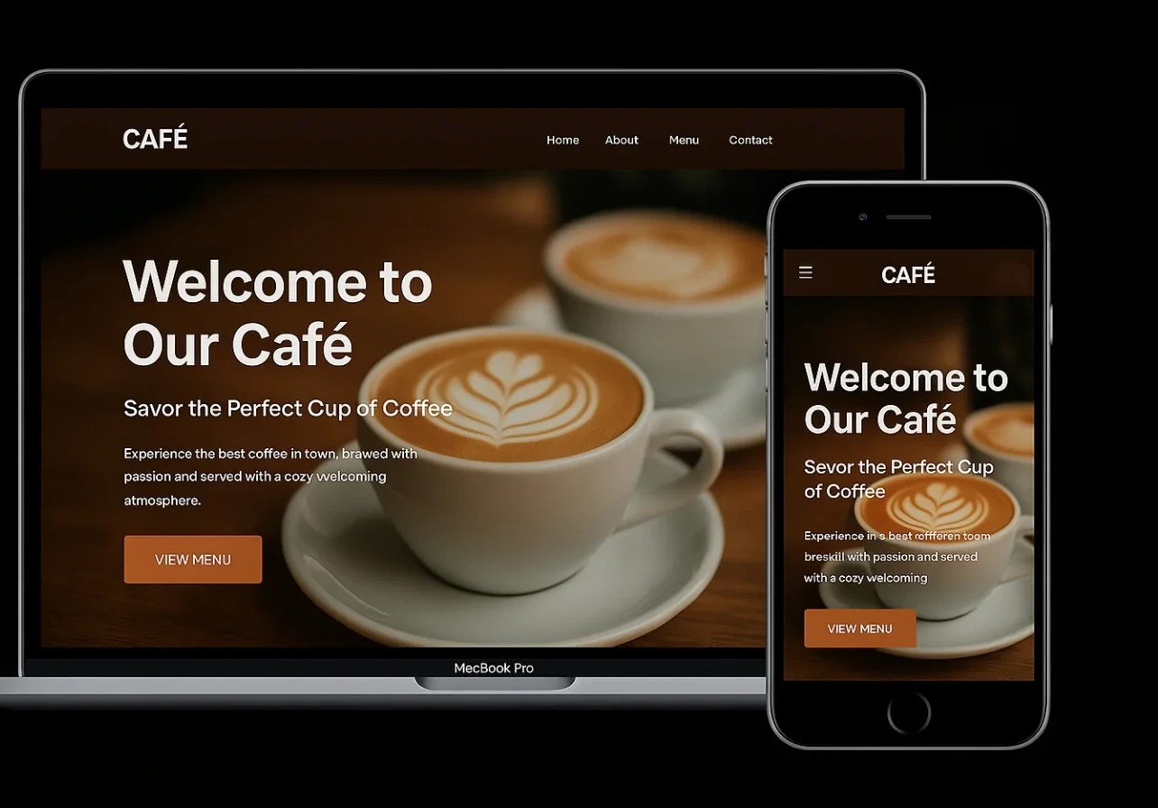
The problem
After Hours had built genuine loyalty among a specific crowd — students, night-shift workers, people who need a coffee shop after 9pm and have nowhere else to go. The website undersold that completely: a generic “Welcome to Our Café” headline, a menu with typos, and no indication anywhere that the hours were the whole point.
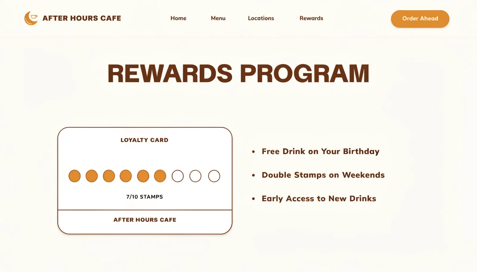
There was no loyalty program presence either, despite the café running punch cards at the register for years. New customers had no way to know a rewards program existed until someone at the counter mentioned it.
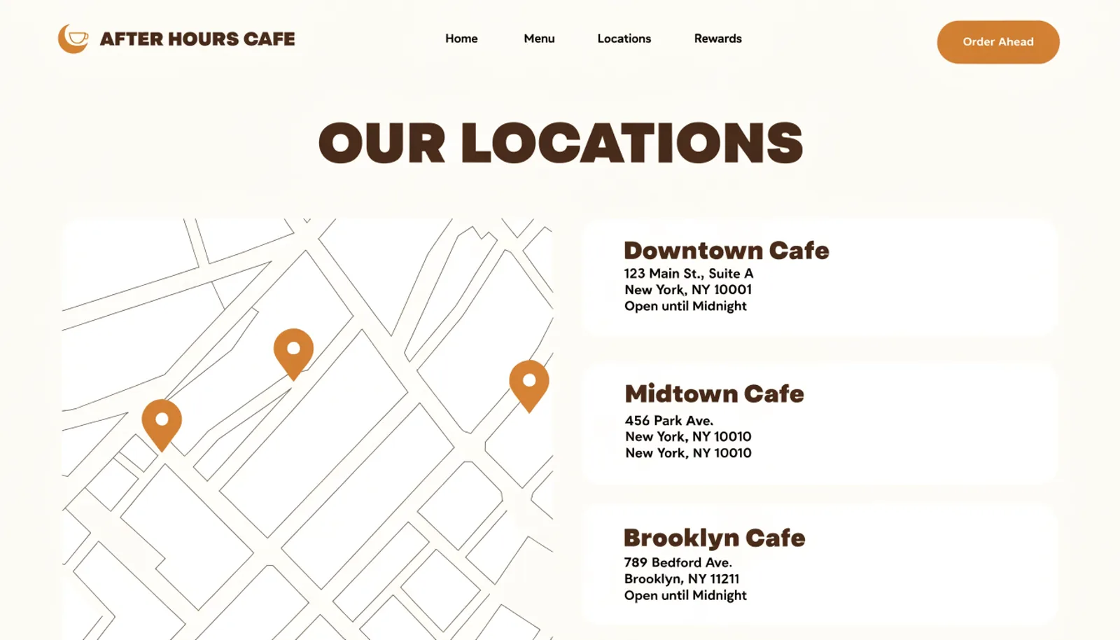
With three locations now open, the site also gave no way to check which ones were actually open late — a real gap for a brand whose entire pitch depends on that information being easy to find.
The approach
Three moves, in order.
01
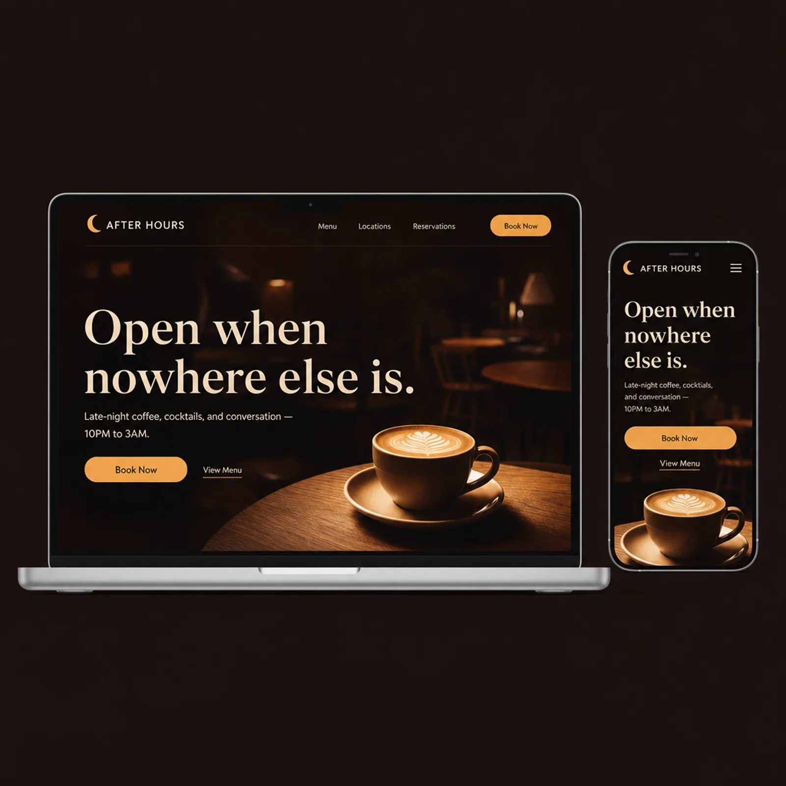
Lead with the hours, not a generic welcome
The late-night positioning moved to the forefront of the brand, replacing a headline that could have belonged to any daytime coffee shop.
02
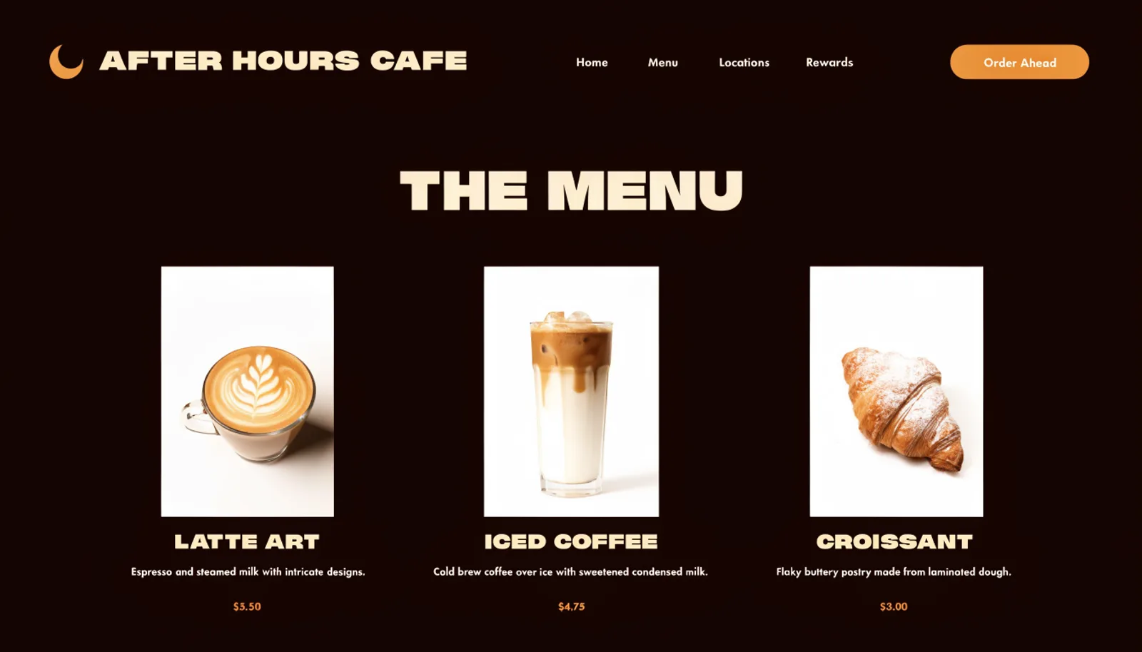
Put the menu online, properly
A full menu with photos, descriptions and prices replaced the single vague paragraph, so customers can decide before they walk in.
03
Bring the rewards program out from behind the counter
A rewards page showing the punch-card progress and perks makes the loyalty program visible to new customers, not just regulars who happened to ask.
The work
What we built.
The new homepage
Also delivered
An order-ahead link for each location, since a meaningful share of the after-hours crowd is heading somewhere specific — a shift, a study session — and doesn't have time to wait in line once they arrive.
Results
First quarter on the new site.
+47%
Late-night orders placed ahead online
+33%
Rewards program sign-ups from new customers
2.4×
Menu page views before visiting
3
Locations, each now showing its real hours
“Our whole thing is being open when nobody else is, and our website never said it. Now that's the first thing people see, and we're getting new customers who found us specifically because they needed somewhere open at 11pm.”
Lena PetrovaOwner, After Hours Café
Figures are illustrative of the outcomes this engagement was designed to produce and are shown here for portfolio purposes.