Fairpoint Mediation · Legal Services
Choosing mediation over a lawyer, blindly
People choose mediation specifically to avoid the adversarial weight of a lawsuit — and then Fairpoint's site asked them to fill out a generic contact form with no idea what kind of dispute the practice even handled.
The problem
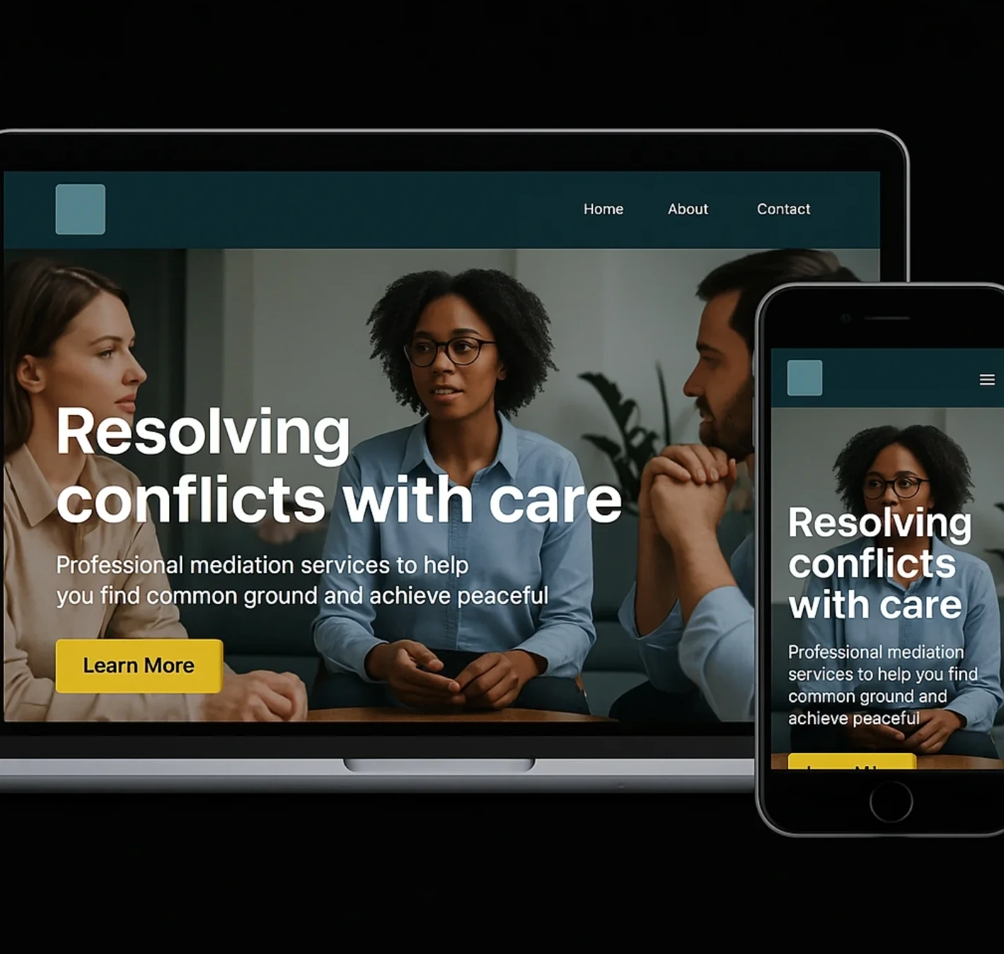
Mediation is a deliberate choice away from litigation — people choose it because they want a calmer, more collaborative process. Fairpoint's site captured that tone in its imagery but gave no practical information: no list of dispute types, no way to request a session, no sense of what mediation actually costs or how many sessions it typically takes.
The site's single contact form asked nothing about the nature of the dispute, which meant Fairpoint's intake process started from zero every time — a business mediation and a divorce mediation arrived indistinguishable, despite requiring very different preparation.
For a service built on reducing anxiety around conflict, a site that itself created uncertainty — what happens next, what to expect — was working against the practice's own value proposition.
The approach
Three moves, in order.
01
Name the dispute types clearly
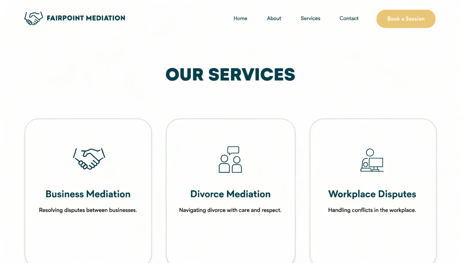
Business Mediation, Divorce Mediation and Workplace Disputes each get their own page, so a visitor recognizes their situation before making contact.
02
Let a session be requested with case context
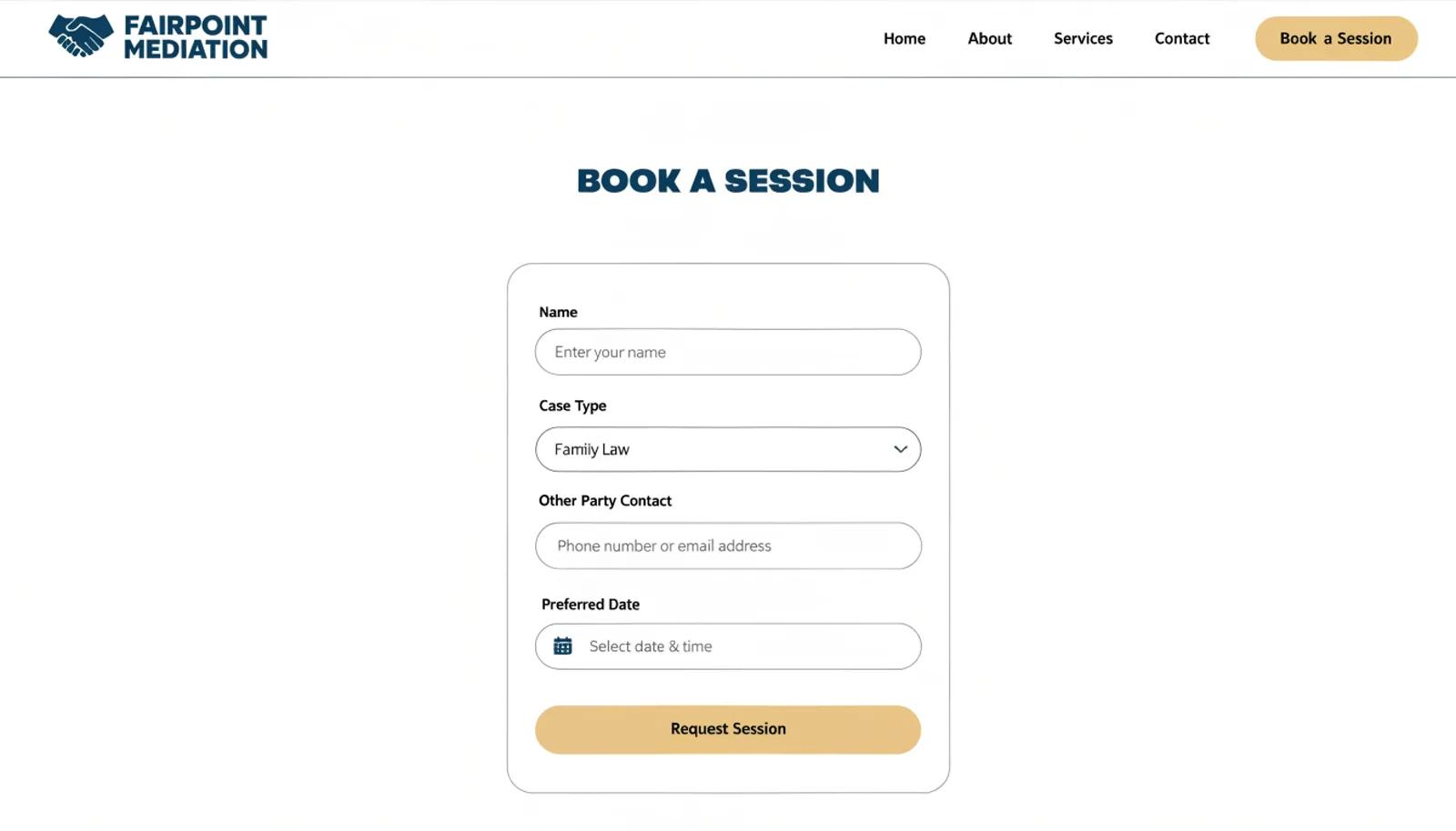
The booking form asks for case type and whether the other party has been contacted, giving the mediator real preparation before the first meeting.
03
Answer the process questions directly
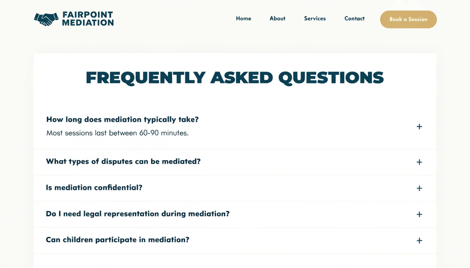
An FAQ covering cost, typical session count and confidentiality reduces the uncertainty that mediation is specifically meant to avoid.
The work
What we built.
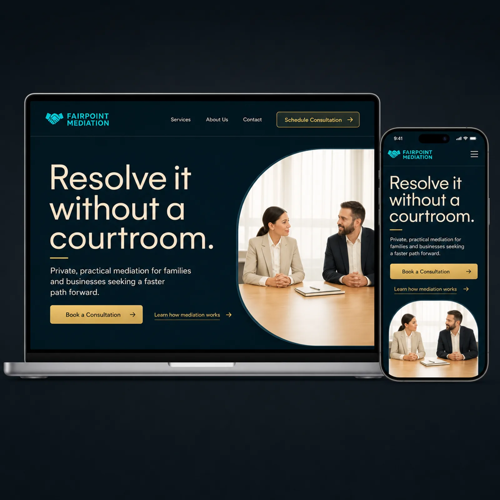
The new homepage
Also delivered
A short explainer on the difference between mediation and litigation, since a portion of visitors were arriving unsure whether they needed a mediator or a lawyer at all.
Results
First two quarters on the new site.
+55%
Session requests with case type specified
38%
Of new clients cite the FAQ as reducing anxiety
−29%
Intake time per new case
3
Dispute types now clearly distinguished
“People come to mediation specifically to avoid uncertainty and our site was full of it. Now someone can see exactly what kind of dispute we handle and what a session actually involves before they ever reach out.”
Simone DelacroixPrincipal Mediator, Fairpoint Mediation
Figures are illustrative of the outcomes this engagement was designed to produce and are shown here for portfolio purposes.