Beni Shen Burger · Food & Beverage
A menu that only existed as a banner ad
Beni Shen Burger had real personality — a bold, playful brand and burgers worth the drive. The site was one promotional banner image, no menu, no locations, no way to order. We built the actual restaurant the brand deserved.
The problem
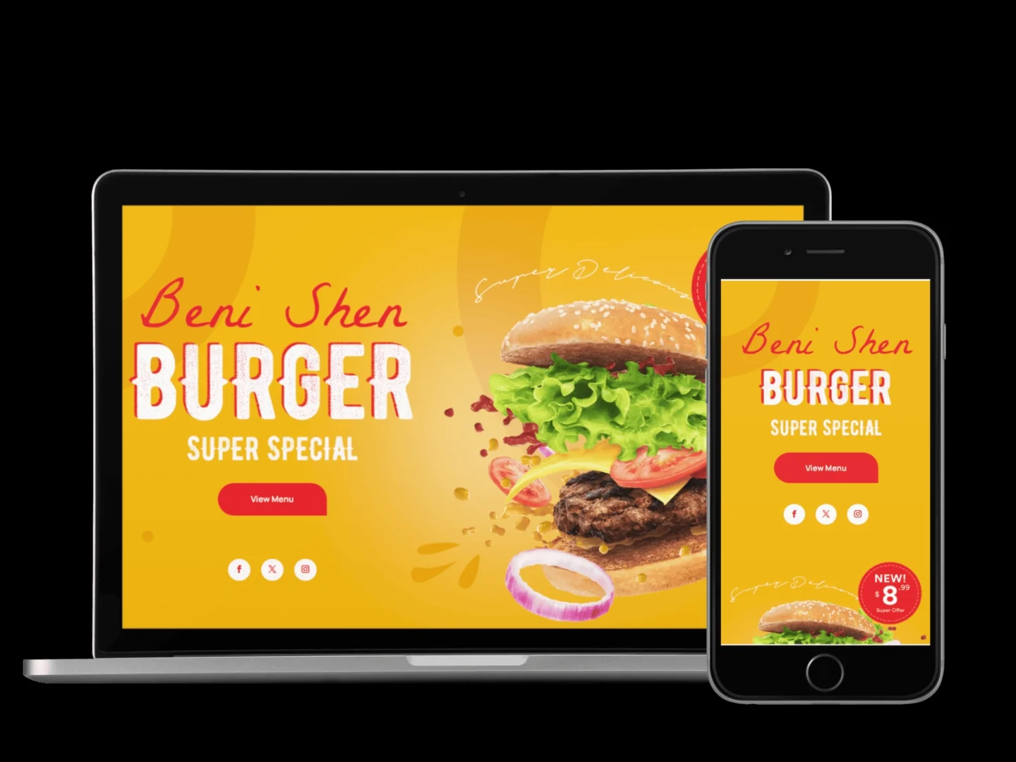
Beni Shen Burger had grown to three locations on the strength of its food and its personality — a loud, playful brand that stood out from every other burger spot in the area. The website hadn't kept up: a single promotional banner image with a discount badge, and nothing else. No menu, no hours, no locations.
A hungry customer searching for the restaurant online found an ad, not a way to decide what to order or where to go. For a multi-location business, that gap was actively costing orders to competitors whose sites at least listed a menu.
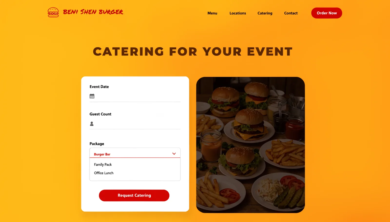
Catering, a growing part of the business fuelled by the brand's popularity at local events, had no presence at all — every catering order started as a DM or a walk-in conversation, with no packages or pricing to point people toward.
The approach
Three moves, in order.
01
Build the menu the banner never had
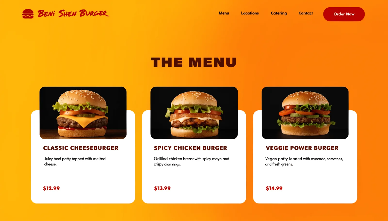
A full menu with photos, descriptions and prices replaced the single promotional image, giving the brand's personality something real to back it up.
02
Make it easy to find a location
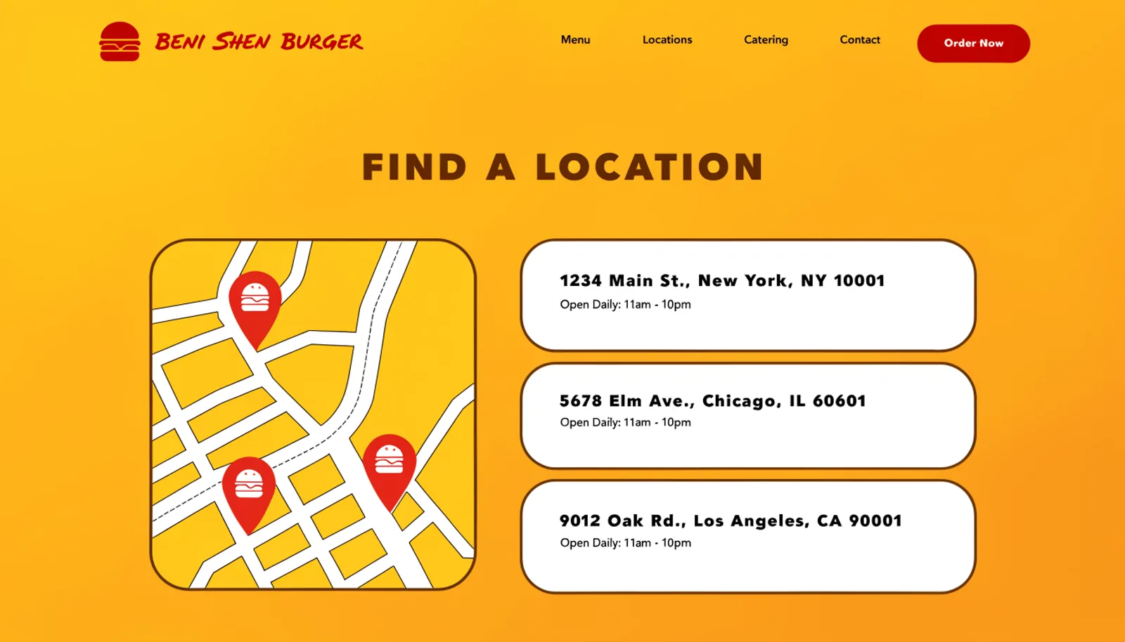
A map and location list with hours for all three spots replaced the total absence of location information on the old site.
03
Turn catering into a real request
Burger Bar, Family Pack and Office Lunch packages give catering customers something to choose from instead of negotiating from scratch over a direct message.
The work
What we built.
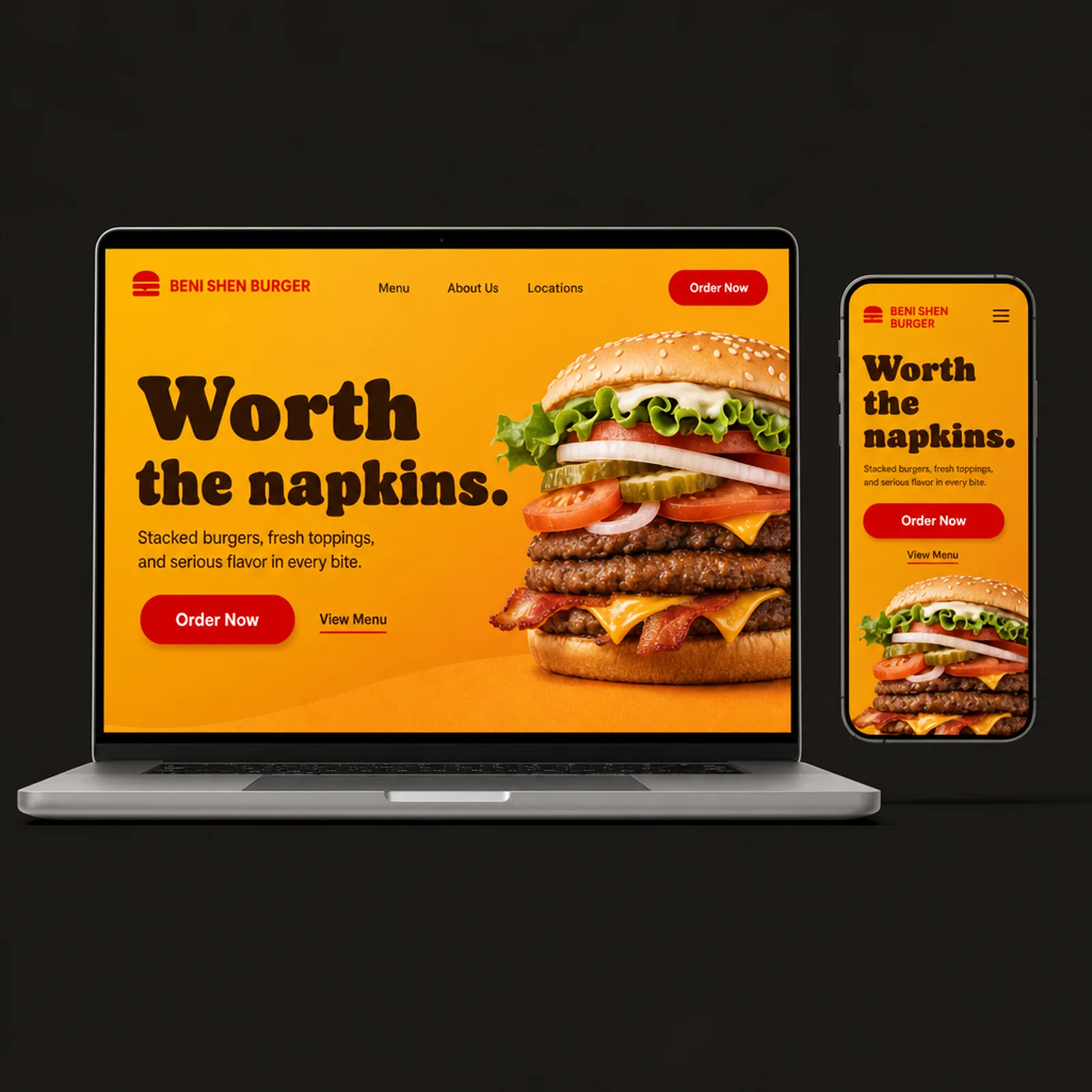
The new homepage
Also delivered
An order-ahead link per location for pickup, since a large share of lunch-rush traffic was walking in cold with no way to skip the line.
Results
First quarter on the new site.
+87%
Menu page views before ordering
+52%
Catering requests submitted with a package selected
2.6×
Location page views across all three spots
1
Menu that finally exists somewhere other than in-store
“We had all this personality and nowhere for people to actually see what we serve. Now the menu does the selling before anyone walks in, and catering stopped being a DM negotiation every single time.”
Beni ShenFounder, Beni Shen Burger
Figures are illustrative of the outcomes this engagement was designed to produce and are shown here for portfolio purposes.